echarts 数据大屏开发时,有些模块的区域比较小,这时候的echarts柱状图的值可能会显示不完整导致很多数据堆叠到了一块,这时候我们需要调整一下。
处理前

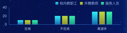
处理后
要在 ECharts 中限制 Y 轴最多显示三条刻度线,您可以使用 yAxis 配置项的 max 和 min 属性来设置 Y 轴的范围。下面是一个示例代码,展示如何将 Y 轴限制在最多显示三条刻度线的范围内:
option = {
    yAxis: {
        max: 2,  // 最大刻度值
        min: 0,  // 最小刻度值
        axisLine: {
            show: true  // 显示 Y 轴线
        },
        axisTick: {
            show: true  // 显示刻度线
        },
        axisLabel: {
            show: true  // 显示刻度标签
        },
        splitLine: {
            show: true  // 显示分隔线
        },
        splitNumber: 2  // 刻度分割数
    },
    // 其他配置项...
};
在上面的示例中,我们通过设置 max 属性为 2 和 min 属性为 0,将 Y 轴的范围限制在 0 到 2 之间。然后,通过 splitNumber 属性设置刻度分割数为 2,表示最多显示三条刻度线(包括 Y 轴两端的刻度)。
您可以根据实际需求调整 max 和 min 的值,以及其他的轴线、刻度和标签样式设置。请注意,以上只是一个简单的示例,实际使用时,您可能需要将该配置项与其他 ECharts 配置项结合起来,以创建完整的图表。
完整实例代码
<template>
  <div class="echarts1" ref="echarts">
  </div>
</template>
<script>
import * as echarts from "echarts"

export default {
  name: 'echarts1',
  components: {},
  data() {
    return {
      xData: ['在岗', '不在岗', '离退休'],
      yData1: [10, 20, 30],
      yData2: [10, 20, 30],
      yData3: [10, 20, 30],
    }
  },
  watch: {},
  mounted() {
    var that = this;
    const viewElem = document.body;
    // 监听窗口变化,重绘echarts
    const resizeObserver = new ResizeObserver(() => {
      setTimeout(() => {
        that.drawEcharts();
      }, 300)
    });
    resizeObserver.observe(viewElem);
  },
  methods: {
    drawEcharts() {
      // 基于准备好的dom,初始化echarts实例
      let myChart = echarts.init(this.$refs.echarts)
      var option = {
        grid: {
          top: '25px',
          bottom: '10px',
          left: '20px',
          right: '20px',
          containLabel: true
        },
        tooltip: {
          trigger: 'axis',
          axisPointer: {
            type: 'shadow',
            shadowStyle: {
              color: new echarts.graphic.LinearGradient(0, 0, 0, 1, [{
                offset: 0,
                color: 'rgba(255, 174, 0, 0.1)'
              }, {
                offset: 1,
                color: 'rgba(255, 174, 0, 0.5)'
              }], false),
            }
          }
        },
        legend: {
          top: 0,
          right: 20,
          itemWidth: 10,
          itemHeight: 10,
          textStyle: {
            color: 'rgba(157, 185, 233, 1)',
            fontSize: '12'
          },
        },
        xAxis: [{
          data: this.xData,
          axisLabel: {
            margin: 10,
            interval: 0,
            color: '#b8c8e8',
            textStyle: {
              fontSize: 11
            },
          },
          axisLine: {
            lineStyle: {
              color: 'rgba(49, 119, 214, 1)',
              width: 1
            }
          },
          splitLine: {
            show: false,
            lineStyle: {
              color: 'rgba(39, 76, 129, 0.26)',
              width: 1,
            }
          },
          axisTick: {
            show: false
          },
        }],

        yAxis: [
          {
            type: 'value',
            splitNumber: 2,
            axisLabel: {
              color: 'rgba(181, 217, 255, 1)',
              textStyle: {
                fontSize: 12
              },
            },
            axisLine: {
              lineStyle: {
                color: 'rgba(49, 119, 214, 1)',
              }
            },
            axisTick: {
              show: false
            },
            splitLine: {
              show: false,
              lineStyle: {
                color: 'rgba(39, 76, 129, 0.26)',
                width: 1,
              }
            }
          }],
        series: [
          {
            name: '校内教职工',
            type: 'bar',
            data: this.yData1,
            barWidth: '15%',
            itemStyle: {
              normal: {
                color: new echarts.graphic.LinearGradient(0, 0, 0, 1, [{
                  offset: 0,
                  color: 'rgba(171, 70, 251, 1)'
                }, {
                  offset: 1,
                  color: 'rgba(112, 0, 201, 0.50)'
                }], false),
              }
            },
          },
          {
            name: '外聘教师',
            type: 'bar',
            data: this.yData2,
            barWidth: '15%',
            itemStyle: {
              normal: {
                color: new echarts.graphic.LinearGradient(0, 0, 0, 1, [{
                  offset: 0,
                  color: 'rgba(255, 201, 11, 1)'
                }, {
                  offset: 1,
                  color: 'rgba(255, 201, 11, 0.40)'
                }], false),
              }
            },
          },
          {
            name: '服务人员',
            type: 'bar',
            data: this.yData3,
            barWidth: '15%',
            itemStyle: {
              normal: {
                color: new echarts.graphic.LinearGradient(0, 0, 0, 1, [{
                  offset: 0,
                  color: 'rgba(2, 255, 186, 1)'
                }, {
                  offset: 1,
                  color: 'rgba(12, 224, 167, 0.40)'
                }], false),
              }
            },
          },
        ]
      }
      myChart.clear()
      myChart.resize()
      myChart.setOption(option)
    },
  }
}
</script>

<style lang="scss" scoped>
.echarts1 {
  position: relative;
  width: 100%;
  height: 100%;
}
</style>


