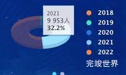
数据可视化大屏 项目开发中,要实现轮播效果,这里我们首先要获取饼状图下一共有多少条数据,然后通过定时,依次激活chart.tooltip.refresh(point);来实现tooltip的轮播效果。
完整实例代码
<template>
<div class="echarts1" id="echarts1" ref="echarts">
</div>
</template>
<script>
import Highcharts from 'highcharts'
import highcharts3d from 'highcharts/highcharts-3d'
highcharts3d(Highcharts)
export default {
name: 'echarts1',
components: {},
props: {
id: {
type: String,
default() {
return ''
}
}
},
data() {
return {
status: ''
}
},
watch: {},
mounted() {
var that = this;
const viewElem = document.body;
// 监听窗口变化,重绘echarts
const resizeObserver = new ResizeObserver(() => {
setTimeout(() => {
that.drawEcharts();
}, 300)
});
resizeObserver.observe(viewElem);
},
methods: {
drawEcharts() {
var that = this
var timer = null
let color1 = [
"rgba(0, 230, 255, 1)",
"rgba(204, 208, 227, 1)"
];
let color2 = [
"rgba(26, 36, 185, 1)",
"rgba(204, 208, 227, 1)",
];
Highcharts.getOptions().colors = Highcharts.map(
Highcharts.getOptions().colors,
function (color, index) {
return {
radialGradient: {cx: 0.5, cy: 0.3, r: 0.7},
stops: [
[0, color2[index]],
[1, color1[index]],
],
};
}
);
var chart = Highcharts.chart(that.$refs.echarts, {
title: {
text: ''
},
chart: {
type: 'pie',
backgroundColor: 'rgba(0,0,0,0)',
options3d: {
enabled: true,
alpha: 70,
innerSize: 10,
beta: 0,
depth: 20,
}
},
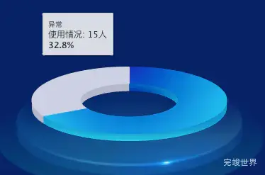
tooltip: {
pointFormat: '{series.name}: {point.y}人<br><b>{point.percentage:.1f}%</b>'
},
credits: {
enabled: false
},
labels: {
style: {
color: 'red'
}
},
plotOptions: {
pie: {
allowPointSelect: true,
cursor: 'pointer',
depth: 15,
size: '100%',
innerSize: '50%',
center: ['50%', '50%'],
dataLabels: {
useHTML: true,
crop: true,
enabled: false,
connectorWidth: 1,
position: 'center',
distance: 0,
x: -15,
connectorShape: 'straight',
borderWidth: 0,
format: '<div class="dataLabels"><b>{point.name}</b>: {point.percentage:.1f} %</div>',
style: {
color: 'rgba(26, 178, 255, 1)'
}
},
}
},
series: [{
type: 'pie',
name: '使用情况',
data: [
['正常', 30.8],
['异常', 15]
]
}]
});
var points = chart.series[0].points;
var len = points.length;
var i = 0;
timer && clearInterval(timer);
timer = setInterval(function () {
autoTooltip(points[i]);
i++;
if (i === len) {
i = 0;
}
}, 1000);
function autoTooltip(point) {
chart.tooltip.refresh(point);
}
},
}
}
</script>
<style lang="scss" scoped>
.echarts1 {
position: relative;
width: 100%;
height: 100%;
background: url("../assets/bingbg.png") center 80% no-repeat;
background-size: 70%;
}
</style>
<style lang="scss">
.dataLabels {
width: 80px;
height: 26px;
position: absolute;
background: rgba(4, 42, 92, 0.7);
display: flex;
justify-content: center;
align-items: center;
flex-wrap: nowrap;
flex-direction: row;
border-top: 3px solid #00aeff;
top: -20px;
left: -20px;
font-size: 14px;
font-family: PingFang;
font-weight: bold;
color: #BBD1EE;
}
</style>