echarts 渐变色柱状图效果,label换行效果实例。
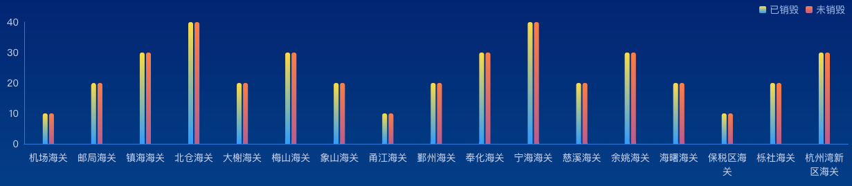
演示实例
组件代码
<template>
  <div className="echarts1" ref="echarts">
  </div>
</template>
<script>
import * as echarts from "echarts"

export default {
  name: 'echarts1',
  components: {},
  props: {
    id: {
      type: String,
      default() {
        return ''
      }
    }
  },
  data() {
    return {
      status: '',
      active: false,
      xData: ['机场海关', '邮局海关', '镇海海关', '北仓海关', '大榭海关', '梅山海关', '象山海关', '甬江海关', '鄞州海关', '奉化海关',
        '宁海海关',
        '慈溪海关',
        '余姚海关',
        '海曙海关',
        '保税区海关',
        '栎社海关',
        '杭州湾新区海关',
      ],
      yData1: [10, 20, 30, 40, 20, 30, 20, 10, 20, 30, 40, 20, 30, 20, 10, 20, 30, 40, 20, 30, 20,],
      yData2: [10, 20, 30, 40, 20, 30, 20, 10, 20, 30, 40, 20, 30, 20, 10, 20, 30, 40, 20, 30, 20,],
    }
  },
  watch: {},
  mounted() {
    this.drawLine()
  },
  methods: {
    drawLine() {
      // 基于准备好的dom,初始化echarts实例
      window.addEventListener('resize', this.drawLine)
      var spliceStr = function (value, len) {
        if (value.length <= len) {
          return value
        }
        var newValue = "";
        var k = 0;
        for (var i = Math.ceil(value.length / len); i > 0; i--) {
          newValue += value.substr(k, len) + (i == 1 ? '' : '\n');
          k += len;
        }
        return newValue;
      }
      let myChart = echarts.init(this.$refs.echarts)
      var option = {
        grid: {
          top: '30px',
          bottom: '0px',
          left: '0px',
          right: '0px',
          containLabel: true
        },
        tooltip: {
          trigger: 'axis',
          axisPointer: {
            type: 'shadow',
            shadowStyle: {
              color: new echarts.graphic.LinearGradient(0, 0, 0, 1, [{
                offset: 0,
                color: 'rgba(255, 174, 0, 0.1)'
              }, {
                offset: 1,
                color: 'rgba(255, 174, 0, 0.5)'
              }], false),
            }
          }
        },
        legend: {
          top: 0,
          right: 0,
          itemWidth: 10,
          itemHeight: 10,
          textStyle: {
            color: 'rgba(157, 185, 233, 1)',
            fontSize: '14'
          },
        },
        xAxis: [{
          data: this.xData,
          axisLabel: {
            margin: 10,
            color: 'rgba(202, 215, 245, 1)',
            interval: 0,
            textStyle: {
              fontSize: 14,
              lineHeight: 20
            },
            formatter: function (value) {
              return spliceStr(value, 4)
            },
          },
          axisLine: {
            lineStyle: {
              color: 'rgba(49, 119, 214, 1)',
              width: 1
            }
          },
          splitLine: {
            show: false,
            lineStyle: {
              color: 'rgba(39, 76, 129, 0.26)',
              width: 1,
            }
          },
          axisTick: {
            show: false
          },
        }],

        yAxis: [
          {
            type: 'value',
            axisLabel: {
              color: 'rgba(202, 215, 245, 1)',
              textStyle: {
                fontSize: 14
              },
            },
            axisLine: {
              lineStyle: {
                color: 'rgba(49, 119, 214, 1)',
              }
            },
            axisTick: {
              show: false
            },
            splitLine: {
              show: false,
              lineStyle: {
                color: 'rgba(39, 76, 129, 0.26)',
                width: 1,
              }
            }
          },
          {
            type: 'value',
            show: false,
            axisLabel: {
              formatter: '{value}%',
              color: 'rgba(130, 153, 191, 1)',
              textStyle: {
                fontSize: 13
              },
            },
            splitLine: {
              lineStyle: {
                color: 'rgba(39, 76, 129, 0.26)',
                width: 1,
              }
            }
          }],
        series: [
          {
            name: '已销毁',
            type: 'bar',
            data: this.yData1,
            barWidth: '7px',
            itemStyle: {
              normal: {
                color: new echarts.graphic.LinearGradient(0, 0, 0, 1, [{
                  offset: 0,
                  color: '#fcdc44'
                }, {
                  offset: 1,
                  color: '#329cfb'
                }], false),
                barBorderRadius: [4, 4, 0, 0],
              }
            },
          },
          {
            name: '未销毁',
            type: 'bar',
            data: this.yData2,
            barWidth: '7px',
            itemStyle: {
              normal: {
                color: new echarts.graphic.LinearGradient(0, 0, 0, 1, [{
                  offset: 0,
                  color: '#fc7e43'
                }, {
                  offset: 1,
                  color: '#b95d90'
                }], false),
                barBorderRadius: [4, 4, 0, 0],
              }
            },
          }]
      }
      myChart.clear()
      myChart.resize()
      myChart.setOption(option)
    },
  }
}
</script>

<style lang="scss" scoped>
.echarts1 {
  position: relative;
  width: 100%;
  height: 100%;
}
</style>


