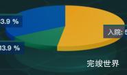
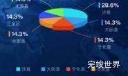
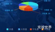
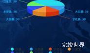
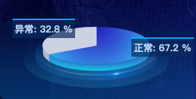
vue数据可视化大屏项目开发中,需要一个3d饼状图效果,并且标签样式要可以自定义效果如下图:
将实现代码记录下来,方便后期复用。
效果演示
效果演示实例
标签要可以自定义样式
Highcharts 3d饼状图标签样式自定义
dataLabels: {
  useHTML: true,
  crop: true,
  enabled: true,
  connectorWidth: 1,
  position: 'center',
  distance: 0,
  x:-15,
  connectorShape: 'straight',
  borderWidth: 0,
  format: '<div class="dataLabels"><b>{point.name}</b>: {point.percentage:.1f} %</div>',
  style: {
    color: 'rgba(26, 178, 255, 1)'
  }
},
颜色要渐变色
Highcharts 3d饼状图渐变色关键代码
let color1 = [
"rgba(0, 230, 255, 1)",
"rgba(204, 208, 227, 1)"
];

let color2 = [
"rgba(26, 36, 185, 1)",
"rgba(204, 208, 227, 1)",
];
Highcharts.getOptions().colors = Highcharts.map(
Highcharts.getOptions().colors,
function (color, index) {
  return {
    radialGradient: {cx: 0.5, cy: 0.3, r: 0.7},
    stops: [
      [0, color2[index]],
      [1, color1[index]],
    ],
  };
}
);
组件代码
<template>
  <div class="echarts1" id="echarts1" ref="echarts">

  </div>
</template>

<script>
import Highcharts from 'highcharts'
import highcharts3d from 'highcharts/highcharts-3d'

highcharts3d(Highcharts)
export default {
  name: 'echarts1',
  components: {},
  props: {
    id: {
      type: String,
      default() {
        return ''
      }
    }
  },
  data() {
    return {
      status: ''
    }
  },
  watch: {},
  mounted() {
    this.drawLine()
  },
  methods: {
    drawLine() {
      var that = this
      window.addEventListener('resize', this.drawLine)
      let color1 = [
        "rgba(0, 230, 255, 1)",
        "rgba(204, 208, 227, 1)"
      ];

      let color2 = [
        "rgba(26, 36, 185, 1)",
        "rgba(204, 208, 227, 1)",
      ];
      Highcharts.getOptions().colors = Highcharts.map(
        Highcharts.getOptions().colors,
        function (color, index) {
          return {
            radialGradient: {cx: 0.5, cy: 0.3, r: 0.7},
            stops: [
              [0, color2[index]],
              [1, color1[index]],
            ],
          };
        }
      );
      var chart = Highcharts.chart('echarts1', {
        title: {
          text: ''
        },
        chart: {
          type: 'pie',
          backgroundColor: 'rgba(0,0,0,0)',
          options3d: {
            enabled: true,
            alpha: 70,
            innerSize: 10,
            beta: 0,
            depth: 20,
          }
        },
        tooltip: {
          pointFormat: '{series.name}: <b>{point.percentage:.1f}%</b>'
        },
        credits: {
          enabled: false
        },
        labels: {
          style: {
            color: 'red'
          }
        },
        plotOptions: {
          pie: {
            allowPointSelect: true,
            cursor: 'pointer',
            depth: 15,
            size: '150%',
            center: ['50%', '50%'],
            dataLabels: {
              useHTML: true,
              crop: true,
              enabled: true,
              connectorWidth: 1,
              position: 'center',
              distance: 0,
              x:-15,
              connectorShape: 'straight',
              borderWidth: 0,
              format: '<div class="dataLabels"><b>{point.name}</b>: {point.percentage:.1f} %</div>',
              style: {
                color: 'rgba(26, 178, 255, 1)'
              }
            },
          }
        },
        series: [{
          type: 'pie',
          name: '使用情况',
          data: [
            ['正常', 30.8],
            ['异常', 15]
          ]
        }]
      });
    },
  }
}
</script>

<style lang="scss" scoped>
.echarts1 {
  position: relative;
  width: 100%;
  height: 100%;
  background: url("../../../../../assets/bingbg.png") center 50px no-repeat;
  background-size: 210px 89px;
}

</style>
<style lang="scss">
.dataLabels {
  width: 80px;
  height: 26px;
  position: absolute;
  background: rgba(4, 42, 92, 0.7);
  display: flex;
  justify-content: center;
  align-items: center;
  flex-wrap: nowrap;
  flex-direction: row;
  border-top: 3px solid #00aeff;
  top: -20px;
  left: -20px;
  font-size: 14px;
  font-family: PingFang;
  font-weight: bold;
  color: #BBD1EE;
}

</style>