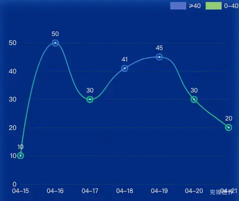
数据可视化大屏 项目开发中,有一个折线图效果,折线图要求label数值大于40显示为蓝色小于40的显示为绿色。这里使用了渐变色的方式来控制线条的颜色。
echarts版本
"echarts": "^5.2.0",
实现代码
drawEcharts() {
  // 基于准备好的dom,初始化echarts实例
  let myChart = echarts.init(this.$refs.echarts)
  var option = {
    legend: {
      icon: 'rect',
      right: 0,
      itemWidth: 32, // 宽度
      itemHeight: 15, // 高度
      data: ['≥40', '0-40'],
      color:['#3b80d6','#0bba8d'],
      textStyle: {
        color: 'rgba(255, 255, 255, 1)'
      }
    },
    tooltip: {
      trigger: 'axis',
    },
    grid: {
      top: '20%',
      left: '10%',
      right: '5%',
      bottom: '15%',
    },
    xAxis: [{
      type: 'category',
      data: ['04-15', '04-16', '04-17', '04-18', '04-19', '04-20', '04-21'],
      axisLine: {
        show: true,
        lineStyle: {
          color: '#0a4573'
        }
      },
      axisTick: {
        show: false
      },
      axisLabel: {
        textStyle: {
          color: 'rgba(255, 255, 255, 1)'
        },
      },
      boundaryGap: false
    }],
    yAxis: [{
      type: 'value',
      axisTick: {
        show: false
      },
      axisLine: {
        show: false,
        lineStyle: {
          color: 'rgba(157, 173, 178, 1)'
        }
      },
      axisLabel: {
        textStyle: {
          color: 'rgba(245, 247, 250, 1)',
          fontSize:13
        }
      },
      splitLine: {
        show: true,
        lineStyle: {
          color: '#0b4170',
          type:'dashed'
        }
      }
    }
    ],
    series: [
      {
        name: '≥40',
        type: 'line',
        show: false, // 不在图表中显示此数据项
      },
      {
        name: '0-40',
        type: 'line',
        show: false, // 不在图表中显示此数据项
      },
      {
        name: '累计确诊1',
        type: 'line',
        data: this.yData1.map((value) => {
          return {
            value: value,
            symbol: value >= 40 ? 'image://' + icon_dot1 : 'image://' + icon_dot2, // 使用自定义图片
            symbolSize: 14, // 设置图片大小
            label: {
              show: true,
              position: 'top',
              color: 'rgba(255, 255, 255, 1)',
              formatter: value
            }
          };
        }),
        symbolSize: 10, // 设置圆点大小
        symbol: 'circle',
        smooth: true,
        yAxisIndex: 0,
        showSymbol: true, // 显示圆点
        lineStyle: {
          width: 2,
          color: new echarts.graphic.LinearGradient(0, 0, 1, 0, this.yData1.map((value, index) => {
            return {
              offset: index / (this.yData1.length - 1),
              color: value >= 40 ? '#3b80d6' : '#0bba8d'
            };
          }))
        }
      }
    ]
  };
  myChart.clear()
  myChart.resize()
  myChart.setOption(option)
},