vue 数据可视化大屏 echarts饼状图开发中,设计图里有一个虚线的边框,以往的话,会考虑用图片来实现,用代码实现的话效果更好一些,于是使用代码来实现。为了让图表更生动,给虚线增加一个旋转的动画。
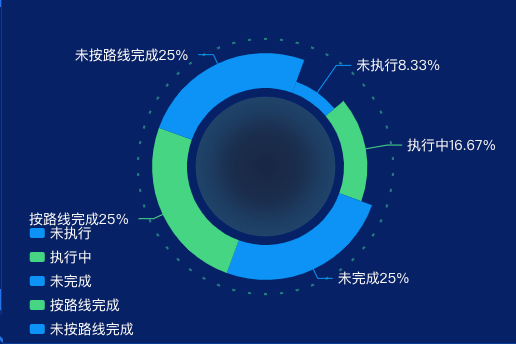
演示实例
使用组件
<template>
  <div class="itemBodys">
    <echarts :list="list"></echarts>
  </div>
</template>

<script>
import echarts from "./components/echarts.vue";
export default {
  data() {
    return {
      list: [{
        name: '未执行',
        value: 10
      }, {
        name: '执行中',
        value: 20
      }, {
        name: '未完成',
        value: 30
      }, {
        name: '按路线完成',
        value: 30
      }, {
        name: '未按路线完成',
        value: 30
      }]
    }
  },
  components: {echarts}
}
</script>

<style lang="scss" scoped>
.itemBodys {
  width: 100%;
  position: relative;
  height: calc(100% - 0px);
}

.echartsBody {
  position: relative;
  width: 100%;
  height: calc(100% - 0px);
  display: flex;
  justify-content: flex-start;
  align-items: center;
  flex-wrap: nowrap;
  flex-direction: row;
  align-content: flex-start;
}
</style>
echarts 组件
<template>
  <div class="echarts1" ref="echarts1">
  </div>
</template>

<script>
import * as echarts from "echarts"

export default {
  name: 'echarts1',
  components: {},
  data() {
    return {
      myChart: {}
    }
  },
  props: {
    list: {
      type: Array,
      default() {
        return [];
      }
    }
  },
  mounted() {
    var that = this;
    const viewElem = document.body;
    // 监听窗口变化,重绘echarts
    const resizeObserver = new ResizeObserver(() => {
      setTimeout(() => {
        that.drawEcharts()
      }, 300)
    });
    resizeObserver.observe(viewElem);

  },
  methods: {
    drawEcharts() {
      var that = this;
      let myChart = this.myChart = echarts.init(this.$refs.echarts1)
      var option = {
        legend: {
          height: '100%',
          show: true,
          orient: 'vertical',
          left: '5%',
          bottom: 'bottom',
          align: 'left',
          textStyle: {
            color: '#fff',
            fontSize: 14
          },
          itemWidth: 15,
          itemHeight: 10,
          itemGap: 10
        },
        series: [
          {
            type: 'pie',
            roseType: 'radius',
            startAngle: 70,
            center: ['50%', '50%'],
            radius: ['45%', '65%'],
            color: ['#0c93f6', '#46d583'],
            labelLine: {
              normal: {
                length: 10
              }
            },
            label: {
              normal: {
                formatter: '{b|{b}} {per|{d}%} ',
                borderColor: 'transparent',
                borderRadius: 4,
                rich: {
                  b: {
                    color: 'rgba(255, 255, 255, 1)',
                    fontSize: 14
                  },
                  per: {
                    color: 'rgba(246, 246, 246, 1)',
                    fontSize: 14,
                    padding: [5, 0, 5, -5]
                  }
                },
                textStyle: {
                  color: '#fff',
                  fontSize: 14
                }
              }
            },
            data: this.list
          },
          {
            type: 'pie',
            name: '饼状背景渐变背景',
            radius: ['0%', '40%'],
            center: ['50%', '50%'],
            startAngle: 110,
            itemStyle: {
              normal: {
                color: new echarts.graphic.RadialGradient(.5, .5, 0.5, [{
                  offset: 0,
                  color: '#182643'
                },
                  {
                    offset: 0.5,
                    color: '#1b2e4e'
                  }, {
                    offset: 0.8,
                    color: '#1d3d62'
                  },
                  {
                    offset: 1,
                    color: '#20446a'
                  }
                ], false),
              }
            },
            tooltip: {
              show: false,
            },
            label: {
              show: false
            },
            data: [50]
          },
          {
            center: ['50%', '50%'],
            type: 'gauge',
            startAngle: 270,
            endAngle: -89.9999,
            axisTick: {
              show: false,
              length: 5,
            },
            axisLabel: {
              show: false,
            },
            radius: '80%',
            splitNumber: '50',
            axisLine: {
              show: false,
              lineStyle: {
                color: 'rgba(143, 153, 163, 1.00)',
                width: 1,
              },
            },
            splitLine: {
              length: 2,
              lineStyle: {
                width: 3,
                color: '#257d7f',
              },
            },
            detail: {
              show: false,
            },
          },
        ]
      }
      myChart.clear()
      myChart.resize()
      myChart.setOption(option)
      var timer;

      function doing() {
        let option = myChart.getOption();
        option.series[2].startAngle = option.series[2].startAngle - 1;
        myChart.setOption(option);
      }

      function startTimer() {
        timer = setInterval(doing, 100);
      }

      function stopTimer() {
        clearInterval(timer);
      }

      setTimeout(startTimer, 1500);
      myChart.on('mouseover', function (params) {
        stopTimer();
      });

      myChart.on('mouseout', function (params) {
        startTimer();
      });
    }
  }
}
</script>

<style lang="scss" scoped>
.echarts1 {
  position: relative;
  width: 100%;
  height: calc(100% - 0px);
}
</style>


