vue 数据可视化大屏 项目开发中经常会遇到各种各样的进度条效果,想来将来可能会遇到类似的效果就将对应的效果实例给记录下来。
如果您需要设计属于自己的 可视化数据大屏 可以联系我们微信:17331886870
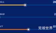
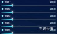
进度条采用标题和进度条同行处理,进度条颜色从透明逐渐加深,并设置倾斜指示点。

组件代码
<template>
  <div class="list">
    <div class="listItem wow fadeInLeft" :data-wow-delay="0+0.3*index+'s'"
         v-for="(item,index) in list"
         :key="index">
      <progressBar :total="total" :item="item"></progressBar>
    </div>
  </div>
</template>

<script>
import progressBar from "./progressBar.vue";
import WOW from "wow.js";

export default {
  data() {
    return {
      list: [
        {
          title: '标题一',
          num: 200,
          color: 'rgba(2, 228, 255, 0.99)',
          color2: 'rgba(2, 228, 255, 0)',
          id: 'teacherTypeFullTime'
        },
        {
          title: '标题二',
          num: 210,
          color: 'rgba(2, 121, 255, 0.99)',
          color2: 'rgba(2, 121, 255, 0)',
          id: 'teacherTypeOffCampus'
        },
        {
          title: '标题三',
          num: 220,
          color: 'rgba(255, 140, 17, 0.99)',
          color2: 'rgba(255, 140, 17, 0)',
          id: 'teacherTypeGraduateDegree'
        },
        {
          title: '标题四',
          num: 210,
          color: 'rgba(183, 240, 29, 0.99)',
          color2: 'rgba(183, 240, 29, 0)',
          id: 'teacherTypeGraduateDegree'
        }]
    }
  },
  props: {
    title: {
      type: String,
      default() {
        return '';
      }
    }
  },
  components: {progressBar},
  computed: {
    total: function () {
      var total = 0
      this.list.forEach((type) => {
        total = total + type.num
      });
      return total
    }
  },
  mounted() {
    var that = this;
    var wow = new WOW({
      boxClass: "wow", // animated element css class (default is wow)
      animateClass: "animated", // animation css class (default is animated)
      offset: 0, // distance to the element when triggering the animation (default is 0)
      mobile: true, // trigger animations on mobile devices (default is true)
      live: true, // act on asynchronously loaded content (default is true)
      callback: function (box) {
        // the callback is fired every time an animation is started
        // the argument that is passed in is the DOM node being animated
      },
      scrollContainer: null, // optional scroll container selector, otherwise use window,
      resetAnimation: true, // reset animation on end (default is true)
    });
    wow.init();
  },
  methods: {},
  filters: {},
  watch: {}
}
</script>

<style lang="scss" scoped>
.list {
  width: calc(100% - 0px);
  display: flex;
  justify-content: flex-start;
  align-items: center;
  flex-wrap: nowrap;
  flex-direction: column;
  align-content: flex-start;
  height: 100%;

  .listItem {
    font-size: 14px;
    display: flex;
    justify-content: flex-start;
    align-items: flex-start;
    flex-wrap: nowrap;
    flex-direction: column;
    align-content: flex-start;
    height: 30%;
    width: 100%;
  }
}
</style>
进度条代码
/**
* @Author: 858834013@qq.com
* @Name: progressBar
* @Date: 2023年05月13日20:14:16
* @Desc: 进度条效果
*/
<template>
  <div class="progressBarBody">
    <div class="progressBarBodyTitle">
      <span>{{ item.title }}</span>
    </div>
    <div class="progressBar">
      <div class="progressBarInner"
           :style="{background: 'linear-gradient(270deg, '+item.color+' 0%, '+item.color2+' 100%)'}"
           ref="progressBarInner"></div>
      <div class="line"></div>
    </div>
  </div>
</template>

<script>
import gsap from "gsap";

export default {
  name: "progressBarBody",
  props: {
    item: {
      type: Object,
      default() {
        return {}
      }
    },
    total: {
      type: Number,
      default() {
        return 0
      }
    },
  },
  data() {
    return {}
  },
  computed: {
    width: function () {
      return (this.item.num / this.total).toFixed(2) * 100
    }
  },
  mounted() {
    setTimeout(() => {
      gsap.to(this.$refs.progressBarInner, {
        duration: 1.5, width: this.width + '%', onComplete: () => {
          console.log('动画完成')
        }
      })
    }, 1000)
  },
  methods: {}
}
</script>

<style lang="scss" scoped>
.progressBarBody {
  display: flex;
  justify-content: flex-start;
  align-items: center;
  flex-wrap: nowrap;
  flex-direction: row;
  align-content: flex-start;
  width: calc(100% - 0px);

  .progressBarBodyTitle {
    font-size: 13px;
    font-family: PingFang SC-Bold, PingFang SC;
    font-weight: bold;
    color: #D7E7FF;
    height: 40px;
    width: 100px;
    display: flex;
    justify-content: space-between;
    align-items: center;
    flex-wrap: nowrap;
    flex-direction: row;
    align-content: flex-start;

    span {
      font-size: 14px;
      font-family: MicrosoftYaHei;
      font-weight: 400;
      color: #FFFFFF;
    }
  }

  .progressBar {
    width: calc(100% - 100px);
    height: 10px;
    //background: linear-gradient(180deg, rgba(#04CEF7, 0.2) 0%, rgba(#1263FF, 0.2) 100%);
    display: flex;
    justify-content: flex-start;
    align-items: center;
    flex-wrap: nowrap;
    flex-direction: row;
    align-content: flex-start;
    position: relative;
  }
}

.progressBarInner {
  height: 10px;
  background: linear-gradient(180deg, #04CEF7 0%, #1263FF 100%);
  opacity: 1;
  width: 0%;
  max-width: calc(100% - 0px);
}

.progressBarl {
  display: flex;
  justify-content: flex-start;
  align-items: center;
  flex-wrap: nowrap;
  flex-direction: row;
  align-content: flex-start;
}

.line {
  background: url("./assets/line.png");
  width: 37px;
  height: 40px;
  opacity: 1;
  margin-left: -20px;
}

.progressBarBodyTitle {
  width: 100%;
  display: flex;
  justify-content: space-between;
  align-items: center;
  flex-wrap: nowrap;
  flex-direction: row;
  align-content: flex-start;
}
</style>