vue 数据可视化大屏 实现进度条效果,通过10种颜色图标实现进度条背景色。
使用组件
<template>
<div class="list">
<div class="titleBody">
<div class="width">贸易额(万美元)</div>
<div class="width2 mr20">占比</div>
</div>
<div class="listBody scrollBar">
<progressBar :index="index" :total="total" :item="item" v-for="(item,index) in list" :key="index"></progressBar>
</div>
</div>
</template>
<script>
import WOW from "wow.js";
import numcard from "@/components/numcard/numcard.vue";
import gsap from 'gsap'
import progressBar from './progressBar.vue'
export default {
name: "title",
data() {
return {
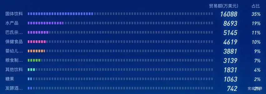
list: [{
title: '固体饮料',
num: 16088
}, {
title: '水产品',
num: 8693
}, {
title: '巴氏杀菌...',
num: 5145
}, {
title: '保健食品',
num: 4619
}, {
title: '婴幼儿配...',
num: 3881
}, {
title: '粮食制品...',
num: 3139
}, {
title: '其他饮料',
num: 1831
}, {
title: '糖果',
num: 1063
}, {
title: '发酵酒及...',
num: 742
}, {
title: '饼干、糕..',
num: 151
},]
}
},
computed: {
total() {
var total = 0
this.list.forEach((type) => {
total += type.num
});
return total
}
},
components: {numcard, progressBar},
watch: {},
mounted() {
var that = this;
var wow = new WOW({
boxClass: "wow",
animateClass: "animated",
offset: 0,
mobile: true,
live: true,
scrollContainer: null,
resetAnimation: true,
});
wow.init();
gsap.to(this.$refs.icon, {
duration: 1, y: 3, repeat: -1, delay: 2, yoyo: true, onComplete: () => {
console.log('动画完成')
}
})
},
}
</script>
<style lang="scss" scoped>
.list {
position: relative;
width: 100%;
height: 100%;
.title {
font-size: 14px;
font-family: MicrosoftYaHei;
font-weight: 400;
color: #FFFFFF;
height: 40px;
display: flex;
justify-content: flex-start;
align-items: center;
flex-wrap: nowrap;
flex-direction: row;
align-content: flex-start;
}
}
.listBody {
position: relative;
width: 100%;
height: calc(100% - 0px);
overflow-y: scroll;
}
.progressBarInner {
height: 10px;
background: linear-gradient(180deg, #04CEF7 0%, #1263FF 100%);
opacity: 1;
width: 0%;
max-width: calc(100% - 60px);
}
.progressBarl {
display: flex;
justify-content: flex-start;
align-items: center;
flex-wrap: nowrap;
flex-direction: row;
align-content: flex-start;
}
.line {
height: 12px;
width: 2px;
background: #04CEF7;
opacity: 1;
margin-left: 2px;
}
.titleBody {
display: flex;
justify-content: flex-end;
align-items: center;
flex-wrap: nowrap;
flex-direction: row;
align-content: flex-start;
.width {
font-size: 14px;
font-family: MicrosoftYaHei;
font-weight: 400;
color: #9DB9E9;
width: 100px;
text-align: right;
}
.width2 {
font-size: 14px;
font-family: MicrosoftYaHei;
font-weight: 400;
color: #9DB9E9;
width: 70px;
text-align: right;
}
}
.mr20 {
margin-right: 25px;
}
</style>
组件代码
/**
* @Author: 858834013@qq.com
* @Name: progressBar
* @Date: 2023年04月28日18:24:21
* @Desc:

*/
<template>
  <div class="progressBarBody">
    <div class="progressBarBodyl">
      <span class="titleInfo">{{ item.title }}</span>
      <div class="progressBarBottom">
        <div class="progressBar">
          <div class="progressBarInner"
               :class="'progressBarInner'+(index+1)"
               ref="progressBarInner"></div>
        </div>
      </div>
    </div>
    <div class="progressBarBodyr">
      <div class="width">
        {{ item.num }}
      </div>
      <div class="width2">
        {{ width }}%
      </div>
    </div>
  </div>
</template>

<script>
import gsap from 'gsap'

export default {
  name: "progressBar",
  components: {},
  props: {
    index: {
      type: Number,
      default() {
        return 0
      }
    },
    item: {
      type: Object,
      default() {
        return {};
      }
    },
    total: {
      type: Number,
      default() {
        return 0
      }
    },
  },
  computed: {
    width: function () {
      return ((this.item.num / this.total) * 100).toFixed(0)
    }
  },
  data() {
    return {}
  },
  watch: {},
  mounted() {
    var that = this;
    gsap.to(this.$refs.progressBarInner, {
      duration: 1, width: this.width + '%', delay: 3, onComplete: () => {
        console.log('动画完成')
      }
    })
  },
  methods: {}
}
</script>

<style lang="scss" scoped>
.progressBarBody {
  display: flex;
  justify-content: space-between;
  align-items: flex-start;
  flex-wrap: nowrap;
  width: calc(100% - 20px);
  flex-direction: row;
  height: 30px;
  align-content: flex-start;

  .progressBarBodyl {
    width: calc(100% - 10px);
    display: flex;
    height: 30px;
    justify-content: flex-start;
    align-items: flex-start;
    flex-wrap: nowrap;
    flex-direction: row;
    align-content: flex-start;


    .titleInfo {
      font-size: 14px;
      font-family: MicrosoftYaHei;
      font-weight: 400;
      color: #9DB9E9;
      width: 70px;
      height: 30px;
      line-height: 30px;
      overflow: hidden;
      white-space: nowrap;
      text-overflow: ellipsis;
    }

    .progressBarBottom {
      display: flex;
      width: calc(100% - 0px);
      margin-left: 10px;
      height: 30px;
      justify-content: flex-start;
      align-items: center;
      flex-wrap: nowrap;
      flex-direction: row;
      align-content: flex-start;
    }
  }

  .progressBarBodyr {
    display: flex;
    justify-content: center;
    align-items: center;
    width: 150px;
    height: 30px;
    flex-wrap: nowrap;
    flex-direction: row;
    align-content: flex-start;
    text-align: right;

    .width {
      width: 100px;
      text-align: right;
      font-size: 22px;
      font-family: DIN;
      font-weight: normal;
      color: #e3effb;
      text-shadow: 0 0 15px #2d85f3;
    }

    .width2 {
      width: 100px;
      text-align: right;
      font-size: 16px;
      font-family: DIN;
      font-weight: normal;
      color: #e3effb;
      text-shadow: 0 0 15px #2d85f3;
    }
  }
}

.progressBar {
  display: flex;
  justify-content: flex-start;
  align-items: center;
  flex-wrap: nowrap;
  flex-direction: row;
  background: url("./assets/jindubg.png") no-repeat;
  background-size: 600px 100%;
  height: 9px;
  width: calc(100% - 0px);
  position: relative;

  .progressBarInner {
    position: relative;
    left: 0;
    height: 9px;
    width: 0%;
    background: url("./assets/jindubg0.png") no-repeat;
    background-size: 600px 100%;
  }

  .progressBarInner1 {
    background: url("./assets/jindubg1.png") no-repeat;
    background-size: 600px 100%;
  }

  .progressBarInner2 {
    background: url("./assets/jindubg2.png") no-repeat;
    background-size: 600px 100%;
  }

  .progressBarInner3 {
    background: url("./assets/jindubg3.png") no-repeat;
    background-size: 600px 100%;
  }

  .progressBarInner4 {
    background: url("./assets/jindubg4.png") no-repeat;
    background-size: 600px 100%;
  }

  .progressBarInner5 {
    background: url("./assets/jindubg5.png") no-repeat;
    background-size: 600px 100%;
  }

  .progressBarInner6 {
    background: url("./assets/jindubg6.png") no-repeat;
    background-size: 600px 100%;
  }

  .progressBarInner7 {
    background: url("./assets/jindubg7.png") no-repeat;
    background-size: 600px 100%;
  }

  .progressBarInner8 {
    background: url("./assets/jindubg8.png") no-repeat;
    background-size: 600px 100%;
  }

  .progressBarInner9 {
    background: url("./assets/jindubg9.png") no-repeat;
    background-size: 600px 100%;
  }
}
</style>