vue 数据可视化大屏 实现进度条效果,效果通过颜色实现渐变色进度条。

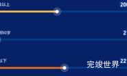
演示地址
使用组件
<template>
  <div class="list">
    <div class="listBody scrollBar">
      <progressBar :index="index" :total="total" :item="item" v-for="(item,index) in list" :key="index"></progressBar>
    </div>
  </div>
</template>

<script>
import WOW from "wow.js";
import numcard from "@/components/numcard/numcard.vue";
import gsap from 'gsap'
import progressBar from './progressBar.vue'

export default {
  name: "title",
  data() {
    return {
      list: [{
        title: '澳大利亚',
        num: 80,
        color: 'rgba(130, 202, 253, 1)',
        color2: 'rgba(22, 153, 255, 1)',
      }, {
        title: '美国',
        num: 70,
        color: 'rgba(107, 192, 172, 1)',
        color2: 'rgba(104, 230, 167, 1)',
      }, {
        title: '日本',
        num: 60,
        color: 'rgba(108, 207, 246, 1)',
        color2: 'rgba(0, 198, 195, 1)',
      }, {
        title: '韩国',
        num: 50,
        color: 'rgba(166, 98, 192, 1)',
        color2: 'rgba(143, 105, 241, 1)',
      }, {
        title: '德国',
        num: 50,
        color: 'rgba(253, 192, 74, 1)',
        color2: 'rgba(244, 130, 50, 1)',
      }]
    }
  },
  computed: {
    total() {
      var total = 0
      this.list.forEach((type) => {
        total += type.num
      });
      return total
    }
  },
  components: {numcard, progressBar},
  watch: {},
  mounted() {
    var that = this;
    var wow = new WOW({
      boxClass: "wow",
      animateClass: "animated",
      offset: 0,
      mobile: true,
      live: true,
      scrollContainer: null,
      resetAnimation: true,
    });
    wow.init();
    gsap.to(this.$refs.icon, {
      duration: 1, y: 3, repeat: -1, delay: 2, yoyo: true, onComplete: () => {
        console.log('动画完成')
      }
    })
  },
}
</script>

<style lang="scss" scoped>
.list {
  position: relative;
  width: 100%;
  height: 100%;

  .title {
    font-size: 14px;
    font-family: MicrosoftYaHei;
    font-weight: 400;
    color: #FFFFFF;
    height: 40px;
    display: flex;
    justify-content: flex-start;
    align-items: center;
    flex-wrap: nowrap;
    flex-direction: row;
    align-content: flex-start;
  }
}

.listBody {
  position: relative;
  width: 100%;
  height: calc(100% - 46px);
  overflow-y: scroll;
}

.progressBarInner {
  height: 10px;
  background: linear-gradient(180deg, #04CEF7 0%, #1263FF 100%);
  opacity: 1;
  width: 0%;
  max-width: calc(100% - 60px);
}

.progressBarl {
  display: flex;
  justify-content: flex-start;
  align-items: center;
  flex-wrap: nowrap;
  flex-direction: row;
  align-content: flex-start;
}

.line {
  height: 12px;
  width: 2px;
  background: #04CEF7;
  opacity: 1;
  margin-left: 2px;
}
</style>
组件代码
/**
* @Author: 858834013@qq.com
* @Name: progressBar
* @Date: 2023年04月27日
* @Desc:

*/
<template>
  <div class="progressBarBody">
    <div class="progressBarBodyl">
      <div class="progressBarBodylTitle">
        <img src="./assets/icon_1.png" alt=""> <span>top.{{ index + 1 }}</span><span>{{ item.title }}</span>
      </div>
      <div class="progressBarBottom">
        <progressBar2 :item="item" :total="total"></progressBar2>
      </div>
    </div>
    <div class="progressBarBodyr">
      <div class="zbtitle"><span v-if="index==0">批次数</span></div>
      <div class="width">
        195
      </div>
    </div>
  </div>
</template>

<script>
import gsap from 'gsap'
import progressBar2 from "./progressBar2.vue";

export default {
  name: "progressBar",
  components: {
    progressBar2,
  },
  props: {
    index: {
      type: Number,
      default() {
        return 0
      }
    },
    item: {
      type: Object,
      default() {
        return {};
      }
    },
    total: {
      type: Number,
      default() {
        return 0
      }
    },
  },
  data() {
    return {}
  },
  watch: {},
  mounted() {
    var that = this;
  },
  methods: {}
}
</script>

<style lang="scss" scoped>
.progressBarBody {
  display: flex;
  justify-content: space-between;
  align-items: flex-start;
  flex-wrap: nowrap;
  width: 100%;
  flex-direction: row;
  align-content: flex-start;
  margin-top: 10px;

  .progressBarBodyl {
    width: calc(100% - 0px);
    display: flex;
    justify-content: flex-start;
    align-items: flex-start;
    flex-wrap: nowrap;
    flex-direction: column;
    align-content: flex-start;

    .progressBarBodylTitle {
      display: flex;
      justify-content: flex-start;
      align-items: center;
      flex-wrap: nowrap;
      flex-direction: row;
      align-content: flex-start;
      font-size: 14px;
      font-family: MicrosoftYaHei;
      font-weight: 400;
      color: #9DB9E9;

      img {
        margin-right: 14px;
      }

      span {
        font-size: 14px;
        font-family: MicrosoftYaHei;
        font-weight: 400;
        color: #CAD7F5;
        margin-right: 15px;
      }
    }

    .progressBarBottom {
      display: flex;
      width: calc(100% - 50px);
      margin-left: 38px;
      justify-content: flex-start;
      align-items: center;
      flex-wrap: nowrap;
      flex-direction: row;
      height: 30px;
      align-content: flex-start;

      .Num {
        font-size: 22px;
        font-family: DIN;
        font-weight: normal;
        color: #FFFFFF;
        margin-left: 16px;
        text-shadow: 0 0 10px rgba(14, 156, 255, 1.00);
      }

    }
  }

  .progressBarBodyr {
    display: flex;
    justify-content: center;
    align-items: center;
    width: 100px;
    flex-wrap: nowrap;
    flex-direction: column;
    align-content: flex-start;

    .zbtitle {
      height: 15px;
      display: flex;
      justify-content: center;
      align-items: center;
      flex-wrap: nowrap;
      flex-direction: row;
      font-size: 14px;
      font-family: MicrosoftYaHei;
      font-weight: 400;
      color: #9DB9E9;
      align-content: flex-start;
    }

    .width {
      width: 62px;
      height: 22px;
      background: linear-gradient(0deg, rgba(#0570E9, 0.2) 0%, rgba(#0ECFF8, 0.2) 100%);
      display: flex;
      justify-content: center;
      align-items: center;
      flex-wrap: nowrap;
      flex-direction: row;
      align-content: flex-start;
      font-size: 14px;
      font-family: MicrosoftYaHei;
      font-weight: 400;
      color: #FFFFFF;
      margin-top: 10px;
    }
  }
}
</style>
子组件进度
/**
* @Author: 858834013@qq.com
* @Name: progressBar
* @Date: 2023年04月28日14:31:26
* @Desc: 进度条效果
*/
<template>
  <div class="progressBarBody2">
    <div class="progressBar">
      <div class="progressBarInner"
           :style="{background: 'linear-gradient(90deg, '+item.color+' 0%, '+item.color2+' 100%)'}"
           ref="progressBarInner"></div>
      <div class="line"></div>
    </div>
  </div>
</template>

<script>
import gsap from "gsap";

export default {
  name: "progressBarBody2",
  props: {
    item: {
      type: Object,
      default() {
        return {}
      }
    },
    total: {
      type: Number,
      default() {
        return 0
      }
    },
  },
  data() {
    return {}
  },
  computed: {
    width: function () {
      return (this.item.num / this.total).toFixed(2) * 100
    }
  },
  mounted() {
    setTimeout(() => {
      gsap.to(this.$refs.progressBarInner, {
        duration: 1.5, width: this.width + '%', onComplete: () => {
          console.log('动画完成')
        }
      })
    }, 2500)
  },
  methods: {}
}
</script>

<style lang="scss" scoped>
.progressBarBody2 {
  display: flex;
  justify-content: flex-start;
  align-items: flex-start;
  flex-wrap: nowrap;
  flex-direction: column;
  align-content: flex-start;
  width: calc(100% - 20px);

  .progressBarBody2Title {
    font-size: 13px;
    font-family: PingFang SC-Bold, PingFang SC;
    font-weight: bold;
    color: #D7E7FF;
    height: 35px;
    display: flex;
    justify-content: flex-start;
    align-items: center;
    flex-wrap: nowrap;
    flex-direction: row;
    align-content: flex-start;
  }

  .progressBar {
    width: 100%;
    height: 4px;
    background: linear-gradient(180deg, rgba(#04CEF7, 0.2) 0%, rgba(#1263FF, 0.2) 100%);
    display: flex;
    justify-content: flex-start;
    align-items: center;
    flex-wrap: nowrap;
    flex-direction: row;
    align-content: flex-start;


    .Num {
      font-size: 14px;
      font-family: DIN-Bold, DIN;
      font-weight: bold;
      color: #FFFFFF;
      margin-left: 10px;
    }
  }
}

.progressBarInner {
  height: 4px;
  background: linear-gradient(90deg, #04CEF7 0%, #1263FF 100%);
  opacity: 1;
  width: 0%;
  max-width: calc(100% - 60px);
}

.progressBarl {
  display: flex;
  justify-content: flex-start;
  align-items: center;
  flex-wrap: nowrap;
  flex-direction: row;
  align-content: flex-start;
}

.line {
  height: 10px;
  width: 4px;
  background: #04CEF7;
  opacity: 1;
  margin-left: 2px;
}
</style>