vue3 数据可视化大屏 开发中,需要展示一些表格效果,今天整理 vue3 表格进度条效果组件。
通过使用flex控制宽度,通过Vue3SeamlessScroll实现列表滚动,使用自定义样式来实现排名表格效果。
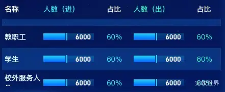
在表格中添加占比进度条组件
演示地址
使用组件
<template>
  <div class="itemBodys newTitle">
    <div class="itemBodysLeft">
      <iTable :list="list"></iTable>
    </div>
  </div>
</template>

<script>
import iTable from './iTable.vue'

export default {
  name: "title",
  data() {
    return {
      list: [
        {
          name: '教职工',
          num: 6000,
          value2: '60%',
          value3: 6000,
          value4: '60%',
        }, {
          name: '学生',
          num: 6000,
          value2: '60%',
          value3: 6000,
          value4: '60%',
        }, {
          name: '校外服务人员',
          num: 6000,
          value2: '60%',
          value3: 6000,
          value4: '60%',
        }, {
          name: '访客',
          num: 6000,
          value2: '60%',
          value3: 6000,
          value4: '60%',
        },]
    }
  },
  components: {iTable},
  watch: {},
  mounted() {
    var that = this;
  },
  methods: {
  },
}
</script>

<style lang="scss" scoped>
.itemBodys {
  position: relative;
  width: calc(100% - 20px);
  height: calc(100% - 0px);
  margin: 0 auto;
  display: flex;
  justify-content: center;
  align-items: center;
  flex-wrap: nowrap;
  flex-direction: row;
  align-content: flex-start;

  .itemBodysLeft {
    width: 100%;
    height: 100%;
  }

  .itemBodysRight {
    width: 232px;
    height: 100%;
  }

  .itemBodysRight2 {
    width: calc(55% - 232px);
    height: 100%;
  }
}

</style>
表格组件
<template>
  <div class="tableCom">
    <div class="tableHead">
      <div class="tableHeadItem" v-for="(item,index) in head" :key="index" :style="{flex:item.flex}">{{ item.title }}
      </div>
    </div>
    <Vue3SeamlessScroll :step="0.5" :wheel="true" :hover="true" :list="list" class="tableBody">
      <div class="tableBody2" v-for="(item,index) in list" :key="index">
        <div class="tableBody2Item" :style="{flex: head[0].flex}">
          <div class="index4">{{ item.name }}</div>
        </div>
        <div class="tableBody2Item" :style="{flex: head[1].flex}">
          <progressBar :total="14000" :item="item"></progressBar>
        </div>
        <div class="tableBody2Item" :style="{flex: head[2].flex}">
          <span class="num" style="color: rgba(41, 241, 250, 1)">{{ item.value2 }}</span>
        </div>
        <div class="tableBody2Item" :style="{flex: head[3].flex}">
          <progressBar :total="14000" :item="item"></progressBar>
        </div>
        <div class="tableBody2Item" :style="{flex: head[4].flex}">
          <span class="num" style="color: rgba(47, 247, 201, 1)">{{ item.value4 }}</span>
        </div>
      </div>
    </Vue3SeamlessScroll>
  </div>
</template>

<script>
import {Vue3SeamlessScroll} from "vue3-seamless-scroll";
import progressBar from './progressBar.vue'

export default {
  name: "tableCom",
  components: {Vue3SeamlessScroll, progressBar},
  props: {
    head: {
      type: Array,
      default() {
        return [{
          title: '名称',
          flex: 0.6
        }, {
          title: '人数(进)',
          flex: 1
        }, {
          title: '占比',
          flex: 0.4
        }, {
          title: '人数(出)',
          flex: 1
        }, {
          title: '占比',
          flex: 0.4
        }];
      }
    },
    list: {
      type: Array,
      default() {
        return [];
      }
    },
  },
  data() {
    return {}
  },
  watch: {},
  mounted() {
  },
  methods: {}
}
</script>

<style lang="scss" scoped>
.tableCom {
  width: calc(100% - 20px);
  margin: 0 auto;
  position: relative;
  height: calc(100% - 60px);
  overflow: hidden;

  .tableHead {
    width: 100%;
    height: 39px;
    //background: rgba(48, 142, 255, 0.3);
    display: flex;
    justify-content: center;
    align-items: center;
    flex-wrap: nowrap;
    flex-direction: row;

    .tableHeadItem {
      font-size: 14px;
      font-family: PingFang SC-Bold, PingFang SC;
      font-weight: bold;
      color: rgba(255, 255, 255, 1);
      display: flex;
      justify-content: flex-start;
      align-items: center;
      flex-wrap: nowrap;
      flex-direction: row;
      padding-left: 5px;
      flex: 1;
    }

    .tableHeadItem:nth-child(2) {
      font-size: 14px;
      font-family: PingFang SC-Medium, PingFang SC;
      font-weight: 500;
      color: #29F1FA;
    }

    .tableHeadItem:nth-child(4) {
      font-size: 14px;
      font-family: PingFang SC-Medium, PingFang SC;
      font-weight: 500;
      color: #2FF7C9;
    }
  }

  .tableBody {
    position: relative;
    height: calc(100% - 34px);
    overflow: hidden;

    .tableBody2 {
      min-height: 34px;
      padding-top: 5px;
      padding-bottom: 5px;
      background: rgba(#308EFF, 0);
      display: flex;
      justify-content: center;
      align-items: center;
      flex-wrap: nowrap;
      flex-direction: row;

      .tableBody2Item {
        font-size: 14px;
        font-family: MicrosoftYaHei;
        font-weight: 400;
        color: #F9FBFF;
        text-shadow: 0px 4px 10px rgba(0, 42, 108, 0.12);
        display: flex;
        justify-content: flex-start;
        align-items: center;
        flex-wrap: nowrap;
        flex-direction: row;
        padding-left: 5px;
        flex: 1;

        .num {
          width: calc(100% - 15px);
          overflow: hidden;
          white-space: nowrap;
          text-overflow: ellipsis;
        }
      }
    }

    .tableBody2:nth-child(2n) {
      background: rgba(48, 142, 255, 0.2);

    }

    .index4 {
      background: rgba(#FF9B2F, 0);
      opacity: 1;
      //margin-left: -18px;
      text-align: left;
      font-size: 14px;
      font-family: PingFang SC-Bold, PingFang SC;
      font-weight: bold;
      color: #E0F9FF;
    }
  }
}

.time1 {
  font-size: 14px;
  font-family: PingFang SC-Bold, PingFang SC;
  font-weight: bold;
  color: #FF9B2F;
}

.time2 {
  font-size: 14px;
  font-family: PingFang SC-Bold, PingFang SC;
  font-weight: bold;
  color: #31EEC5;
}

.time3 {
  font-size: 14px;
  font-family: PingFang SC-Bold, PingFang SC;
  font-weight: bold;
  color: #54D6FF;
}

.time4 {
  font-size: 14px;
  font-family: PingFang SC-Regular, PingFang SC;
  font-weight: 400;
  color: #F9FBFF;
}
</style>
占比进度条组件
/**
* @Author: 858834013@qq.com
* @Name: progressBar
* @Date: 2023年04月15日
* @Desc: 进度条效果
*/
<template>
  <div class="progressBarBody">
    <div class="progressBar">
      <div class="progressBarInner" ref="progressBarInner"></div>
      <div class="line"></div>
      <div class="Num"><span>{{ item.num }}</span></div>
    </div>
  </div>
</template>

<script>
import gsap from "gsap";

export default {
  name: "progressBarBody",
  props: {
    item: {
      type: Object,
      default() {
        return {}
      }
    },
    total: {
      type: Number,
      default() {
        return 0
      }
    },
  },
  data() {
    return {}
  },
  computed: {
    width: function () {
      return (this.item.num / this.total).toFixed(2) * 100
    }
  },
  mounted() {
    setTimeout(() => {
      gsap.to(this.$refs.progressBarInner, {
        duration: 1.5, width: this.width + '%', onComplete: () => {
          console.log('动画完成')
        }
      })
    }, 2500)
  },
  methods: {}
}
</script>

<style lang="scss" scoped>
.progressBarBody {
  display: flex;
  justify-content: flex-start;
  align-items: flex-start;
  flex-wrap: nowrap;
  flex-direction: column;
  align-content: flex-start;
  width: calc(100% - 20px);

  .Num {
    font-size: 14px;
    font-family: DIN-Bold, DIN;
    font-weight: bold;
    color: #FFFFFF;
    position: absolute;
    width: 100%;
    display: flex;
    justify-content: flex-end;
    align-items: center;
    flex-wrap: nowrap;
    flex-direction: row;
    align-content: flex-start;

    span {
      margin-right: 6px;
    }
  }

  .progressBarBodyTitle {
    font-size: 13px;
    font-family: PingFang SC-Bold, PingFang SC;
    font-weight: bold;
    color: #D7E7FF;
    height: 35px;
    display: flex;
    justify-content: flex-start;
    align-items: center;
    flex-wrap: nowrap;
    flex-direction: row;
    align-content: flex-start;
  }

  .progressBar {
    width: 100%;
    height: 13px;
    background: linear-gradient(180deg, rgba(#04CEF7, 0.2) 0%, rgba(#1263FF, 0.2) 100%);
    display: flex;
    justify-content: flex-start;
    align-items: center;
    flex-wrap: nowrap;
    flex-direction: row;
    align-content: flex-start;
    position: relative;
  }
}

.progressBarInner {
  height: 13px;
  background: linear-gradient(180deg, #04CEF7 0%, #1263FF 100%);
  opacity: 1;
  width: 0%;
  max-width: calc(100% - 0px);
}

.progressBarl {
  display: flex;
  justify-content: flex-start;
  align-items: center;
  flex-wrap: nowrap;
  flex-direction: row;
  align-content: flex-start;
}

.line {
  height: 15px;
  width: 2px;
  background: #04CEF7;
  opacity: 1;
  margin-left: 2px;
}
</style>
项目应用
vue3 滚动表格效果 在数据可视化大屏项目中的使用实例