其实就是对一个角做了圆角处理。
label换行处理
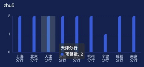
运行实例
<template>
  <div class="echarts1" ref="echarts">

  </div>
</template>

<script>

import {FontChart} from "@/utils/utils";

export default {
  name: 'echarts1',
  components: {},
  props: {},
  data() {
    return {
      list: [
        {
          "bankId": "001",
          "bankName": "上海分行",
          "num": 2
        },
        {
          "bankId": "002",
          "bankName": "北京分行",
          "num": 2
        },
        {
          "bankId": "003",
          "bankName": "天津分行",
          "num": 2
        },
        {
          "bankId": "004",
          "bankName": "深圳分行",
          "num": 2
        },
        {
          "bankId": "005",
          "bankName": "苏州分行",
          "num": 2
        },
        {
          "bankId": "006",
          "bankName": "杭州分行",
          "num": 2
        },
        {
          "bankId": "007",
          "bankName": "宁波分行",
          "num": 1
        },
        {
          "bankId": "008",
          "bankName": "成都分行",
          "num": 2
        },
        {
          "bankId": "009",
          "bankName": "南京分行",
          "num": 2
        }
      ]
    }
  },
  watch: {
    list() {
      this.drawLine()
    },
  },
  mounted() {
    this.drawLine()
  },
  methods: {
    drawLine() {
      var that = this
      window.addEventListener('resize', this.drawLine)
      let myChart = this.$echarts.init(this.$refs.echarts)
      var xdata = []
      var ydata = []
      var data = that.list
      data.forEach((type) => {
        xdata.push(type.bankName)
        ydata.push(type.num)
      });
      var spliceStr = function (value, len) {
        if (value.length <= len) {
          return value
        }
        var newValue = "";
        var k = 0;
        for (var i = Math.ceil(value.length / len); i > 0; i--) {
          newValue += value.substr(k, len) + (i == 1 ? '' : '\n');
          k += len;
        }
        return newValue;
      }
      var option = {
        tooltip: {
          trigger: 'axis',
          axisPointer: {
            type: 'shadow'
          }
        },
        grid: {
          left: '3%',
          right: '4%',
          bottom: '12%',
          top: '8%',
          containLabel: true
        },
        yAxis: {
          type: 'value',
          minInterval: 1,
          splitLine: {
            show: true,
            lineStyle: {
              color: 'rgba(21, 58, 121, 0.66)',
              type: 'dashed'
            }
          },
          axisLine: {
            lineStyle: {
              color: 'rgba(32, 72, 141, 1)'
            }
          },
          axisTick: {
            show: false
          },
          axisLabel: {
            color: 'rgba(190, 198, 218, 1)'
          }
        },
        xAxis: {
          type: 'category',
          data: xdata,
          axisLine: {
            lineStyle: {
              color: 'rgba(32, 72, 141, 1)'
            }
          },
          axisTick: {
            show: false
          },
          axisLabel: {
            color: 'rgba(190, 198, 218, 1)',
            fontSize: FontChart(14),
            interval: 0,
            formatter: function (value) {
              return spliceStr(value, 2)
            },
          }
        },
        series: [
          {
            name: '预警量',
            type: 'bar',
            barWidth: 10,
            barGap: '40%',
            data: ydata,
            itemStyle: {
              barBorderRadius: [8, 2, 0, 0],
              color: {
                type: 'linear',
                x: 0,
                y: 1,
                x2: 0,
                y2: 0,
                colorStops: [{
                  offset: 0, color: '#0267D5' // 0% 处的颜色
                }, {
                  offset: 1, color: '#0267D5' // 100% 处的颜色
                }],
                global: false // 缺省为 false
              }
            }
          },
        ]
      };
      myChart.clear()
      myChart.resize()
      myChart.setOption(option)
    },
  }
}
</script>

<style lang="scss" scoped>
.echarts1 {
  position: relative;
  width: 100%;
  height: calc(100% - 10px);
}
</style>