最近看到一个css特效卡片边缘流光效果,感觉很不错,整理过来,将来可能会用到。使用@keyframes rotation关键帧动画,让圆环从 0 度旋转到 360 度,实现发光彩色圆环特效的卡片
效果整理自:css特效之发光卡片
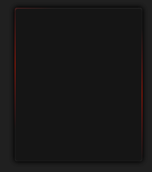
效果截图
动态效果
效果代码
<!DOCTYPE html>
<html lang="en">

<head>
    <meta charset="UTF-8">
    <meta http-equiv="X-UA-Compatible" content="IE=edge">
    <meta name="viewport" content="width=device-width, initial-scale=1.0">
    <title>css特效之发光卡片</title>
    <link rel="stylesheet">
</head>

<body>
<div class="container">
    <div class="card">
        <div class="card-content"></div>
    </div>
</div>
</body>

</html>
<style>
    * {
        padding: 0px;
        margin: 0px;
    }

    .container {
        display: flex;
        align-items: center;
        justify-content: center;
        background: #202020;
        height: 100vh;
    }

    .card {
        position: relative;
        height: 300px;
        width: 250px;
        background: #202020;
        border-radius: 4px;
        box-shadow: 0px 0px 10px 1px #000;
        overflow: hidden;
    }

    /** 使用 ::before 伪元素创建一个旋转的彩色圆环。
     *  它相对于 .card 定位,位于卡片顶部,并向上偏移100px。
     *  content 属性为空,width 为250px,height 为160%(超出卡片高度,以确保完整的旋转圆环)。
     *  background 使用线性渐变创建了一个彩色的效果,从透明到红色再到透明,方向为90度。
     *  animation 属性指定了一个名为 rotation 的动画,在5000毫秒内无限循环播放,使用线性时间函数
     **/
    .card::before {
        position: absolute;
        top: -100px;
        content: '';
        width: 250px;
        height: 160%;
        background: linear-gradient(90deg, transparent,
        #ff1e00, transparent);
        animation: rotation 5000ms infinite linear;
    }

    .card-content {
        position: absolute;
        top: 0.5%;
        left: 0.5%;
        width: 99%;
        height: 99%;
        background-color: #151515;
        border-radius: 5px;
        color: white;
    }
    /**
     * 定义了名为 rotation 的关键帧动画。从0%到100%,旋转 transform 从0度变为360度,实现圆环的旋转效果。
     */
    @keyframes rotation {
        0% {
            transform: rotateZ(0deg);
        }

        0% {
            transform: rotateZ(360deg);
        }
    }
</style>