最近看到一个css特效之炫酷的发光按钮,感觉很不错,整理过来,将来可能会用到。
效果整理自:css特效之炫酷的发光按钮
效果截图
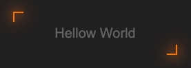
动态效果
效果代码
<!DOCTYPE html>
<html lang="en">
<head>
    <meta charset="UTF-8">
    <meta http-equiv="X-UA-Compatible" content="IE=edge">
    <meta name="viewport" content="width=device-width, initial-scale=1.0">
    <title>按钮</title>
    <link rel="stylesheet" href="./css/index.css">
</head>
<body>
<button>
    <span>Hellow World</span>
    <div class="top"></div>
    <div class="bottom"></div>
    <div class="left"></div>
    <div class="right"></div>
</button>
</body>
</html>
<style>
    body {
        display: flex;
        justify-content: center;
        background-color: #202020;
    }

    button {
        position: relative;
        margin-top: 300px;
        padding: 20px 60px;
        cursor: pointer;
        transition: 0.5s all;
        background-color: #202020;
        border: none;
    }

    button span {
        color: #646464;
        font-size: 20px;
    }

    button:hover {
        box-shadow: inset 0px 0px 25px #ff7700;
    }

    button:active {
        margin-top: 305px;
        transition: 0.2s all;
        box-shadow: inset 0px 0px 25px #ffaf6a;
    }


    button div {
        transition: 0.5s all;
        position: absolute;
        background-color: #ff7700;
        box-shadow: 0 0 15px #ff7700, 0 0 30px #ff7700, 0 0 50px #ff7700;
    }

    button .top {
        width: 15px;
        height: 2px;
        top: 0;
        left: 0;
    }

    button .bottom {
        width: 15px;
        height: 2px;
        bottom: 0;
        right: 0;
    }

    button .left {
        width: 2px;
        height: 15px;
        top: 0;
        left: 0;
    }

    button .right {
        width: 2px;
        height: 15px;
        right: 0;
        bottom: 0;
    }

    button:hover .top,
    button:hover .bottom {
        width: 100%;
    }

    button:hover .left,
    button:hover .right {
        height: 100%;
    }
</style>