在项目开发过程中,一般背景图片使用一个背景图就可以了,但是在实际项目开发中,会遇到各种情况,比如同一个组件需要在不同的宽高下使用,这时候如果复用同一个背景图那么图片就会变形。
多背景图拼接
在之前的项目开发中,遇到这种情况会使用vue 实现安卓.9图片类似的效果九宫格图片,这种类似九宫格的方式来实现。通过相对定位的方式将图片一个一个的拼接起来。
方法一:九宫格div拼接的方式
九宫格图片
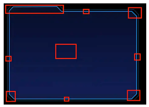
九宫格代码
下面的代码就是将一张图片切割成九分做成9个div,然后通过css的相对定位,来将div一点一点的拼接在一起。达到我们想要的效果。不过这样的话,代码就比较多了,于是就在思考,有没有办法更精炼一些呢?
/**
* @Author: 858834013@qq.com
* @Name: gridView
* @Date: 2023年07月20日09:15:45
* @Desc: 仿安卓.9图九宫格效果
*/
<template>
  <div class="gridView">
    <!--  左上角-->
    <div class="gLeftTop"></div>
    <!--  顶部中间-->
    <div class="gTopCenter"></div>
    <!--  右上角-->
    <div class="gRightTop"></div>
    <!--    中间部分-->
    <div class="gCenterMain">
      <!--  左侧中间-->
      <div class="gLeftCenter"></div>
      <!--  右侧中间-->
      <div class="gRightCenter"></div>
      <!--  中间-->
      <div class="gCenter"></div>
    </div>
    <!--  左下角-->
    <div class="gLeftBottom"></div>
    <!--  底部中间-->
    <div class="gBottomCenter"></div>
    <!--  右下角-->
    <div class="gRightBottom"></div>
  </div>
</template>

<script>

export default {
  name: "gridView"
}
</script>

<style lang="scss" scoped>
.gridView {
  position: absolute;
  top: 0;
  left: 0;
  width: 100%;
  height: 100%;
  min-height: 80px;
  min-width: 250px;
  bottom: 0;
  right: 0;
  pointer-events: none; //避免div层被点击
  //左上角
  .gLeftTop {
    background: url("./assets/left_top.png") no-repeat;
    background-size: 100% 100%;
    position: absolute;
    left: 0;
    width: 194PX;
    height: 40PX;
  }

  //顶部中间
  .gTopCenter {
    width: calc(100% - 194PX - 24PX);
    left: 194PX;
    position: absolute;
    height: 40PX;
    background: url("./assets/top_center.png") repeat-x;
    background-size: 100% 100%;
  }

  //右上角
  .gRightTop {
    background: url("./assets/right_top.png") no-repeat;
    background-size: 100% 100%;
    position: absolute;
    right: 0;
    top: 0;
    width: 24PX;
    height: 40PX;
  }

  //左下角
  .gLeftBottom {
    background: url("./assets/left_bottom.png") no-repeat;
    background-size: 100% 100%;
    position: absolute;
    left: 0;
    bottom: 0;
    width: 24PX;
    height: 24PX;
  }

  //底部中间
  .gBottomCenter {
    width: calc(100% - 24PX - 24PX);
    left: 24PX;
    bottom: 0;
    position: absolute;
    height: 24PX;
    background: url("./assets/bottom_center.png") repeat-x;
    background-size: 100% 100%;
  }

  //右下角
  .gRightBottom {
    background: url("./assets/right_bottom.png") no-repeat;
    background-size: 100% 100%;
    position: absolute;
    right: 0;
    bottom: 0;
    width: 24PX;
    height: 24PX;
  }

  //中间部分
  .gCenterMain {
    width: 100%;
    height: calc(100% - 64PX);
    position: absolute;
    top: 40PX;
    bottom: 24PX;
    //左侧中间
    .gLeftCenter {
      left: 0;
      height: 100%;
      position: absolute;
      background: url("./assets/left_center.png");
      background-size: 8PX 100%;
      width: 8PX;
    }

    .gCenter {
      width: calc(100% - 8PX - 8PX);
      left: 8PX;
      bottom: 0;
      position: absolute;
      height: 100%;
      background: url("./assets/center.png");
      background-size: 100% 100%;
    }

    //右侧中间
    .gRightCenter {
      height: 100%;
      position: absolute;
      right: 0;
      background: url("./assets/right_center.png");
      background-size: 100% 100%;
      width: 8PX;
    }
  }
}
</style>
经过一段时间的研究和摸索,终于找到了另一种css背景图的方式。
css背景图的方式
背景图片在不同宽高下不变形,使用css来实现的话,是利用css的background-image可以同时设置多个背景图的方式来实现的,这里也是将图片切割成多份。然后通过background-image来引入,然后结合background-repeat设置重复模式,结合background-position来设置图片位置,结合background-size来设置图片大小,最终实现我们想要的效果。
在九宫格div拼接的方式中我们需要写很长一段代码,但是用css的方式就要精炼很多了,只需要下面这一段代码就能实现方法一所能实现的效果。
css背景图拼接
.itemMain {
  position: relative;
  width: 100%;
  height: calc(100% - 55px);
  background-image: url('./assets/leftTop.png'),
  url('./assets/top.png'),
  url('./assets/rightTop.png'),
  url('./assets/leftCenter.png'),
  url('./assets/center.png'),
  url('./assets/rightCenter.png'),
  url('./assets/leftBottom.png'),
  url('./assets/bottom.png'),
  url('./assets/rightBottom.png');
  background-repeat: no-repeat,
  no-repeat,
  no-repeat,
  no-repeat,
  no-repeat,
  no-repeat,
  no-repeat,
  no-repeat,
  no-repeat,
  no-repeat,
  no-repeat;
  background-position: top left,
  15PX top,
  top right,
  left 15PX,
  5PX 15PX,
  right 15PX,
  bottom left,
  15PX bottom,
  bottom right;
  background-size: 15PX 15PX,
  calc(100% - 15PX - 15PX) 15PX,
  15PX 15PX,
  5PX calc(100% - 15PX - 33PX),
  calc(100% - 5PX - 5PX) calc(100% - 15PX - 33PX),
  5PX calc(100% - 15PX - 33PX),
  15PX 33PX,
  calc(100% - 15PX - 35PX) 33PX,
  35PX 33PX;
}
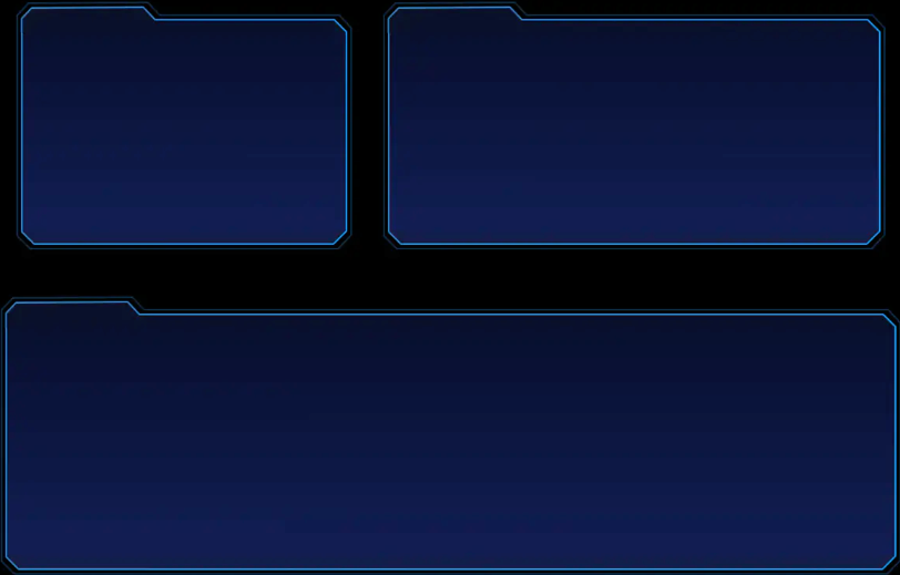
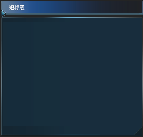
最终达到下面使用同一个div在不同宽高下仍然能够保持不变形的效果。
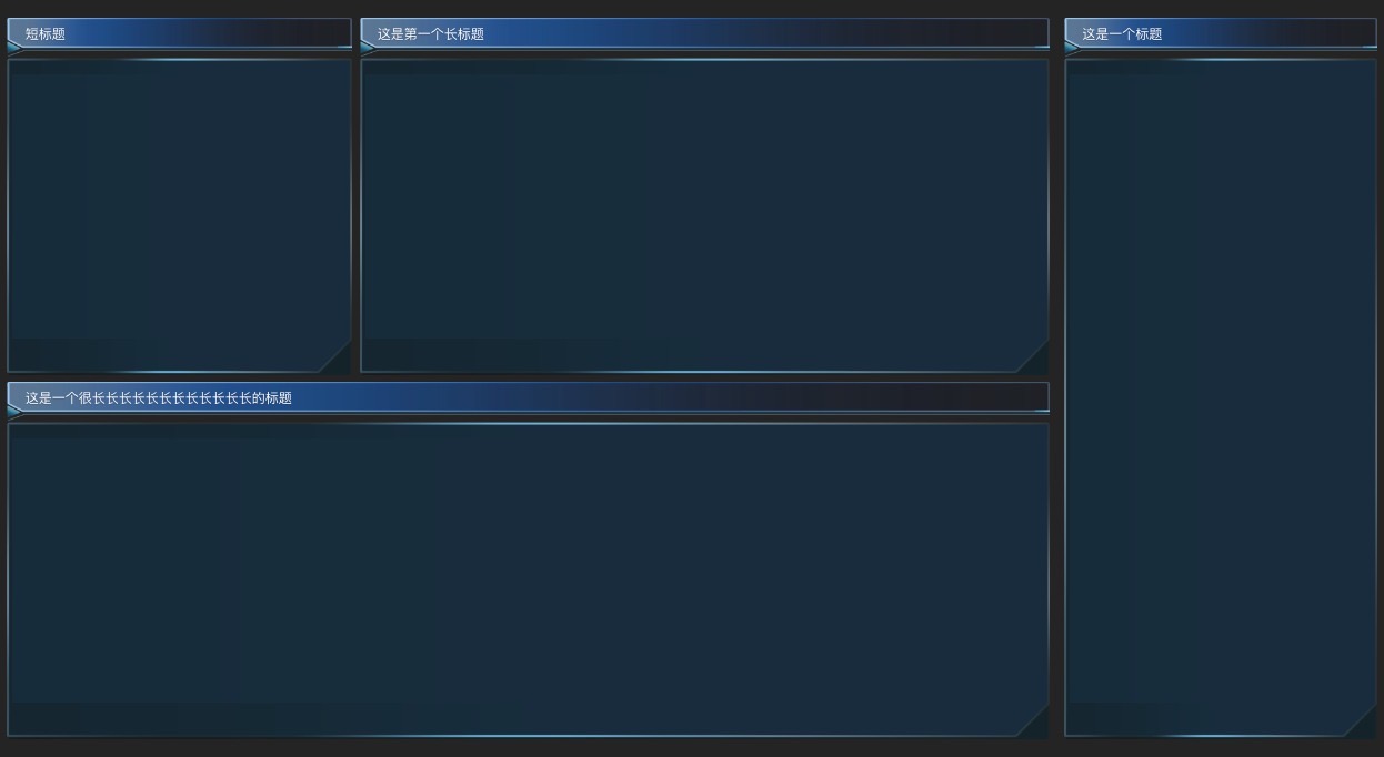
背景图三段写法
异形图片左中右,将可能变形的区域写死,左侧固定宽高,右侧固定宽高,中间可以无限拉伸的就可以不做宽度限制了。
.title {
    height: 32PX;
    min-width: 148px;
    margin: 0 auto;
    padding: 0 20px;
    background-image: url('./assets/titleLeft.png'),
    url('./assets/titleCenter.png'),
    url('./assets/titleRight.png');
    background-repeat: no-repeat, no-repeat, no-repeat;
    background-position: top left, 47PX top, top right;
    background-size: 47PX 100%, calc(100% - 47PX - 47PX) 100%, 47PX 100%;
    display: flex;
    justify-content: center;
    align-items: center;
    flex-wrap: nowrap;
    flex-direction: row;
    align-content: flex-start;

    span {
      font-size: 18px;
      font-family: YouSheBiaoTiHei;
      font-weight: 400;
      color: #DEF1FF;
      padding-top: 5px;
    }
  }