数据大屏项目开发过程中,会增加一些动画效果,让大屏页面看起来更加酷炫.今天我们来实现一个自上而下展开的动画效果.
效果截图
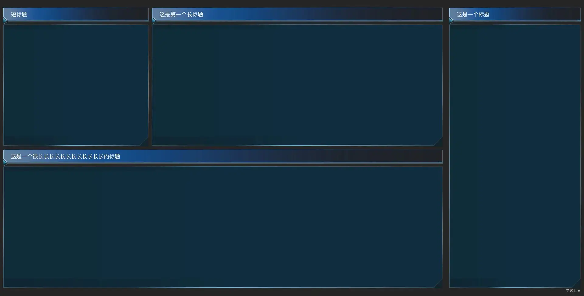
动态效果
实现思路
在上面的动画效果中,我们要实现的是自上而下的展开动画,动画执行完成后,再显示内容。
首先隐藏我们要显示的内容,然后再做一个div,给这个div一个背景渐变色,然后动态设置这个高度,让其从1变到100,达到100以后,我们再隐藏我们的背景色,把应该要显示的内容显示出来。
html部分
html分为两部分,一个背景部分 一个主题
<div class="pageItemBody">
    <div class="bg" ref="bg" v-if="!show"></div>
    <div class="title" v-if="show">
      <span>{{ title }}</span>
    </div>
    <div class="itemMain" v-if="show">
      <slot></slot>
    </div>
</div>
js
使用gsap来动态调整div的高度,动画执行完成后,我们显示div的高度。因为数据可视化大屏 中可能会复用多个组件,并且每个组件动画开始时间和持续时间都不同,我们可以把延迟时间以及持续时间的参数抽离出来。
gsap.to(this.$refs.bg, {
  height: '100%',
  delay: that.delay,
  duration: that.duration, // 动画持续时间(以秒为单位)
  ease: 'none', // 使用线性动画缓动函数
  onComplete: () => {
    // 动画完成后触发的回调函数
    console.log('动画执行完成');
    setTimeout(() => {
      that.show = true
    }, 100)
  },
});
css
.pageItemBody {
  width: 100%;
  position: relative;
  height: 100%;
  display: flex;
  justify-content: flex-start;
  align-items: flex-start;
  flex-wrap: nowrap;
  flex-direction: column;
  z-index: 1;
  align-content: flex-start;

  .title {
    height: 55px;
    width: 100%;
    background-image: url('./assets/titleLeft.png'),
    url('./assets/titleCenter.png'),
    url('./assets/titleRight.png');
    background-repeat: no-repeat, no-repeat, no-repeat;
    background-position: top left, 16PX top, top right;
    background-size: 16PX 100%, calc(100% - 16PX - 13PX) 100%, 13PX 100%;
    display: flex;
    justify-content: flex-start;
    align-items: center;
    flex-wrap: nowrap;
    flex-direction: row;
    align-content: flex-start;

    span {
      font-size: 18px;
      font-family: SourceHanSansCN;
      font-weight: 400;
      color: #FFFFFF;
      text-shadow: 0px 2px 1px rgba(0, 14, 17, 0.19);
      margin-left: 25px;
      margin-bottom: 10px;
    }
  }

  .itemMain {
    position: relative;
    width: 100%;
    height: calc(100% - 55px);
    background-image: url('./assets/leftTop.png'),
    url('./assets/top.png'),
    url('./assets/rightTop.png'),
    url('./assets/leftCenter.png'),
    url('./assets/center.png'),
    url('./assets/rightCenter.png'),
    url('./assets/leftBottom.png'),
    url('./assets/bottom.png'),
    url('./assets/rightBottom.png');
    background-repeat: no-repeat,
    no-repeat,
    no-repeat,
    no-repeat,
    no-repeat,
    no-repeat,
    no-repeat,
    no-repeat,
    no-repeat,
    no-repeat,
    no-repeat;
    background-position: top left,
    15PX top,
    top right,
    left 15PX,
    5PX 15PX,
    right 15PX,
    bottom left,
    15PX bottom,
    bottom right;
    background-size: 15PX 15PX,
    calc(100% - 15PX - 15PX) 15PX,
    15PX 15PX,
    5PX calc(100% - 15PX - 33PX),
    calc(100% - 5PX - 5PX) calc(100% - 15PX - 33PX),
    5PX calc(100% - 15PX - 33PX),
    15PX 33PX,
    calc(100% - 15PX - 35PX) 33PX,
    35PX 33PX;
  }

  .bg {
    height: 0;
    position: relative;
    width: 100%;
    background: linear-gradient(to bottom, rgba(22, 85, 109, 0.3), rgba(22, 85, 109, 1));
  }
}
到这里一个自上而下展开动画效果就实现了。
完整实例代码
<template>
  <div class="pageItemBody">
    <div class="title" v-if="show">
      <span>{{ title }}</span>
    </div>
    <div class="itemMain" v-if="show">
      <slot></slot>
    </div>
    <bg v-if="show"></bg>
    <div class="bg" ref="bg"></div>
  </div>
</template>

<script>
import gsap from 'gsap'
import bg from './bg.vue'

export default {
  name: "title",
  data() {
    return {
      show: false
    }
  },
  components: {
    bg,
  },
  props: {
    title: {
      type: String,
      default() {
        return '测试的';
      }
    },
    delay: {
      type: Number,
      default() {
        return 0;
      }
    },
    duration: {
      type: Number,
      default() {
        return 0.5;
      }
    },
  },
  mounted() {
    var that = this;
    gsap.to(this.$refs.bg, {
      height: '100%',
      delay: that.delay,
      duration: that.duration, // 动画持续时间(以秒为单位)
      ease: 'none', // 使用线性动画缓动函数
      onComplete: () => {
        // 动画完成后触发的回调函数
        console.log('动画执行完成');
        setTimeout(() => {
          that.show = true
        }, 100)
      },
    });
  },
}
</script>

<style lang="scss" scoped>
.pageItemBody {
  width: 100%;
  position: relative;
  height: 100%;
  display: flex;
  justify-content: flex-start;
  align-items: flex-start;
  flex-wrap: nowrap;
  flex-direction: column;
  z-index: 1;
  align-content: flex-start;

  .title {
    height: 32PX;
    min-width: 148px;
    margin: 0 auto;
    padding: 0 20px;
    background-image: url('./assets/titleLeft.png'),
    url('./assets/titleCenter.png'),
    url('./assets/titleRight.png');
    background-repeat: no-repeat, no-repeat, no-repeat;
    background-position: top left, 47PX top, top right;
    background-size: 47PX 100%, calc(100% - 47PX - 47PX) 100%, 47PX 100%;
    display: flex;
    justify-content: center;
    align-items: center;
    flex-wrap: nowrap;
    flex-direction: row;
    align-content: flex-start;

    span {
      font-size: 18px;
      font-family: YouSheBiaoTiHei;
      font-weight: 400;
      color: #DEF1FF;
      padding-top: 5px;
    }
  }
}

.bg {
  height: 50%;
  position: relative;
  width: 100%;
  background: linear-gradient(to bottom, rgba(22, 85, 109, 0.3), rgba(22, 85, 109, 1));
}

.itemMain {
  position: relative;
  width: 100%;
  height: calc(100% - 50px);
}
</style>