上一节,我们实现了使用echarts绘制柱状图,这一节我们来完成第二个区域的功能,使用echarts绘制环形饼状图.
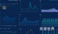
设计图的效果图如下:

看效果比较眼熟,和自己之前做过的项目数据可视化大屏 - 固废全过程一个效果很相似,我们拿过来改一下应该就可以用了。当我们效果积累到多了,就会遇到很多类似的效果,到时候就可以拿过来复用。

当环形图的颜色是单一色调的时候,label颜色可以跟着环形图变化,当环形图是渐变色的时候,label就默认是黑色了,所以这里指定了一个固定的蓝色效果。
使用echarts绘制效果

因为背景图在左侧,为了让环形背景图不会错位,echarts和右侧的描述分离开单独写的。
整体代码
首先写右侧的列表,通过vue的style来让背景色跟着列表里提供的色值进行变化,添加了一个选中字段,根据选中字段判断是否选中了,选中操作后刷新echarts图表
<template>
  <div class="itemBodyInner">
    <div class="echartsBody">
      <echarts ref="echarts" :list="list"></echarts>
      <div class="list">
        <div class="listItem cur" @click="getChecked(index)" v-for="(item,index) in list" :key="index">
          <div class="dot" :class="{disabled:!item.checked}"
               :style="'background: linear-gradient(90deg,'+item.color1+' 0%, '+item.color2+' 100%);'"></div>
          <span :class="{disabled:!item.checked}">{{ item.name }}</span>
        </div>
      </div>
    </div>
  </div>
</template>

<script>
import echarts from "./echarts.vue";

export default {
  data() {
    return {
      active: '1',
      list: [
        {
          name: '专任教师数',
          value: 40,
          color1: 'rgba(255, 183, 0, 1)',
          color2: 'rgba(255, 183, 0, 0.7)',
          checked: true
        },
        {
          name: '聘请校外教师数',
          value: 30,
          color1: 'rgba(0, 255, 255, 1)',
          color2: 'rgba(0, 255, 255, 0.7)',
          checked: true
        },
        {
          name: '具有研究生学位专任教师数',
          value: 30,
          color1: 'rgba(47, 84, 235, 1)',
          color2: 'rgba(47, 84, 235, 0.7)',
          checked: true
        },
        {
          name: '具有副高级以上职务的专任教师数',
          value: 30,

          color1: 'rgba(102, 71, 255, 1)',
          color2: 'rgba(136, 126, 255, 0.7)',
          checked: true
        }]
    }
  },
  components: {echarts},
  computed: {},
  mounted() {

  },
  methods: {
    getChecked(index) {
      this.list[index].checked = !this.list[index].checked
      this.$refs.echarts.drawEcharts()
    }
  },
  filters: {},
  watch: {}
}
</script>

<style lang="scss" scoped>
.itemBodyInner {
  width: 100%;
  position: relative;
  height: calc(100% - 0px);
}

.echartsBody {
  position: relative;
  width: 100%;
  height: calc(100% - 0px);
  display: flex;
  justify-content: flex-start;
  align-items: center;
  flex-wrap: nowrap;
  flex-direction: row;
  align-content: flex-start;

  .list {
    width: calc(40% - 30px);
    margin-left: 0px;

    .listItem {
      font-size: 14px;
      margin-bottom: 20px;
      margin-top: 20px;
      display: flex;
      justify-content: flex-start;
      align-items: flex-start;
      flex-wrap: nowrap;
      flex-direction: row;
      align-content: flex-start;

      span {
        font-size: 14px;
        font-family: PingFang SC-Regular, PingFang SC;
        font-weight: 400;
        color: #E0F9FF;
      }

      .dot {
        width: 17px;
        height: 8px;
        margin-right: 10px;
        flex-shrink: 0;
        margin-top: 6px;
      }

      .dot.disabled {
        background: rgba(#999, 0.8) !important;
      }

      span.disabled {
        color: rgba(#999, 0.8) !important;
      }
    }
  }
}
</style>
echarts代码
echarts在左侧,图表左侧居中,使用computed来计算总数。通过设置roseType来让图标根据数值的大小来控制大小。
<template>
  <div class="echarts1s">
    <div class="echarts1" ref="echarts">

    </div>
    <div class="title">
      <div class="num">
        {{ total }}
      </div>
      <p>{{ title }}</p>
    </div>
  </div>
</template>

<script>
import * as echarts from "echarts"

export default {
  name: 'echarts1',
  components: {},
  data() {
    return {
      title: '教师总数(人)',
      num: '',
      dataIndex: 0
    }
  },
  props: {
    list: {
      type: Array,
      default() {
        return [];
      }
    }
  },
  watch: {
    list() {
      this.drawEcharts()
    },
  },
  computed: {
    total: function () {
      var total = 0
      this.list.forEach((type) => {
        total = total + type.value
      });
      return total
    },
    colorList: function () {
      var colorList = []
      this.list.forEach((type) => {
        if (type.checked) {
          var color = new echarts.graphic.LinearGradient(0, 0, 1, 0, [{
            offset: 0,
            color: type.color1
          },
            {
              offset: 1,
              color: type.color2
            }
          ])
          colorList.push(color)
        }
      });
      return colorList
    }
  },
  mounted() {
    this.drawEcharts()
  },
  methods: {
    drawEcharts() {
      var that = this
      window.addEventListener('resize', this.drawEcharts)
      let myChart = echarts.init(this.$refs.echarts)
      var colors = this.colorList
      var data = that.list
      var data = []
      that.list.forEach((type) => {
        if (type.checked) {
          data.push(type)
        }
      });
      var option = {
        color: colors,
        series: [
          {
            name: '教工',
            type: 'pie',
            radius: ['55%', '75%'],
            center: ['50%', '50%'],
            roseType: 'radius',
            label: {
              normal: {
                show: true,
                fontSize: 14,
                position: ['50%', '50%'],
                fontFamily: 'DIN-bold',
                color: 'rgba(6, 233, 239, 1.00)',
                align: 'center',
                formatter: '{c}人',
              },
            },
            labelLine: {
              show: true,
              length: 5,
              length2: 5
            },
            data: data
          }
        ]
      }
      myChart.clear()
      myChart.resize()
      myChart.setOption(option)
    },
  }
}
</script>

<style lang="scss" scoped>
.echarts1 {
  position: absolute;
  width: 100%;
  height: 100%;
  background: url("./bg.png") center center no-repeat;
  background-size: 85%;
  top: 0;
  z-index: 1;
}

.echarts1s {
  width: 60%;
  height: 100%;
  position: relative;
  //margin: 0 auto;
  margin-left: 20px;
}

.title {
  position: absolute;
  width: 100%;
  height: 100%;
  top: 0;
  z-index: 2;
  pointer-events: none;
  display: flex;
  justify-content: center;
  align-items: center;
  flex-wrap: nowrap;
  flex-direction: column;
  align-content: flex-start;

  .num {
    font-size: 24px;
    font-family: DIN-Bold;
    font-weight: bold;
    color: rgba(255, 255, 255, 1.00);
  }

  p {
    font-size: 13px;
    font-family: PingFang;
    font-weight: bold;
    color: rgba(148, 198, 254, 1.00);
    margin: 0;
  }
}
</style>
更多数据可视化大屏教程
vue3 vite 数据可视化大屏教程