vue3 数据可视化大屏项目开发前,我们需要先对大屏进行布局,把整体框架给搭建起来,然后一块作为,其他区域每一块作为一个组件单独来写,最后就像堆积木一样,将其放在对应的位置这样一个数据大屏页面就完成了。
头部和主体
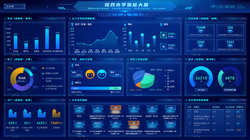
从上面的数据大屏设计图来看,我们可以先分为两部分,头部和身体两部分。
头部按照设计图来宽度百分百高度也按照设计图的高度来。
下面的主体身体部位我们也是按照宽度百分百高度为100-头部高度-底部空余,这就是主体的大小了。
实现代码
我们通过css 将主体宽高设置为100%,然后通过css的calc方法减去头部和底部的高度就是主体了。
html
  <div class="home">
    <Top title="综合办学指标大屏" desc="Educational conditions indicator screen"></Top>
    <div class="homeMain">

    </div>
  </div>
css
  .homeMain {
    width: 100%;
    position: relative;
    z-index: 100;
    height: calc(100% - 130px);
    margin-top: -54px;
    display: flex;
    background: red;
    justify-content: space-between;
    align-items: flex-start;
    flex-wrap: nowrap;
    flex-direction: row;
    align-content: flex-start;
  }
数据大屏主体布局
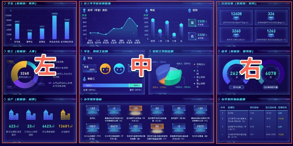
头部和主体布局搞定后,我们就可以处理中间部分了,根据设计图来看,我们可以先把设计图分为左中右三部分。左中右中间都有一些间隔,我们通过百分比计算。
通过像素来看,
左侧宽度为472,距离左侧30 距离中间24 (472+30)/页面宽度1920 约等于26%
右侧宽度为472,距离右侧30 距离中间24 (472+30)/页面宽度1920 约等于26%
html
<div class="homeMain">
  <!--      左-->
  <div class="homeMainLeft"></div>
  <!--      中-->
  <div class="homeMainCenter"></div>
  <!--      右-->
  <div class="homeMainRight"></div>
</div>
css
我们通过css实现,通过flex来让其布局
左侧:width: calc(26% - 30px); margin-left: 30px;
中间:width: calc(48% - 24px - 24px); margin-left: 30px;
右侧:width: calc(26% - 30px); margin-right: 30px;
  .homeMain {
    width: 100%;
    position: relative;
    z-index: 100;
    height: calc(100% - 130px);
    margin-top: -54px;
    display: flex;
    background: red;
    justify-content: space-between;
    align-items: flex-start;
    flex-wrap: nowrap;
    flex-direction: row;
    align-content: flex-start;

    .homeMainLeft {
      margin-left: 30px;
      height: 100%;
      width: calc(26% - 30px);
      position: relative;
      display: flex;
      justify-content: space-between;
      align-items: center;
      flex-wrap: nowrap;
      flex-direction: column;
      align-content: flex-start;
    }

    .homeMainCenter {
      height: 100%;
      width: calc(48% - 24px - 24px);
      position: relative;
      display: flex;
      justify-content: space-between;
      align-items: center;
      flex-wrap: nowrap;
      flex-direction: column;
      align-content: flex-start;
    }

    .homeMainRight {
      margin-right: 30px;
      height: 100%;
      width: calc(26% - 30px);
      position: relative;
      display: flex;
      justify-content: space-between;
      align-items: center;
      flex-wrap: nowrap;
      flex-direction: column;
      align-content: flex-start;
    }
  }
分析封装
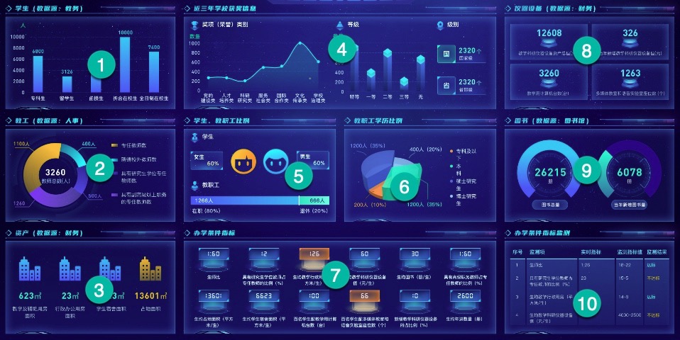
通过分析,我们把他们分为10个模块,这10个模块的都有标题以及一个背景边框,所以我们把这一部分单独封装为一个组件。
这样整个框架就基本搭建起来了,然后就是对内部进行填充
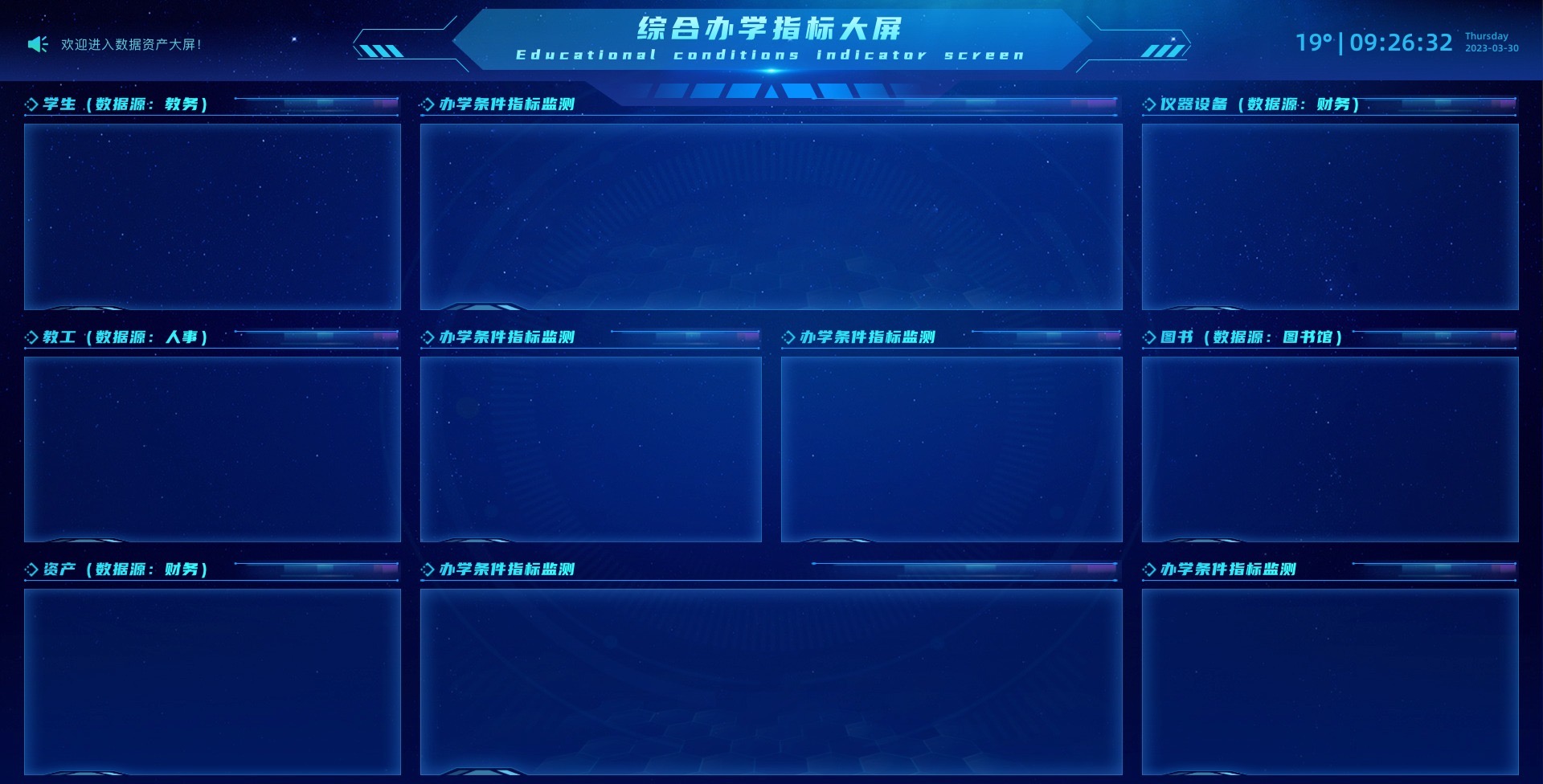
html
    <div class="homeMain">
      <!--      左-->
      <div class="homeMainLeft">
        <div class="homeMainLeftItem">
          <itemTitle title="学生(数据源:教务)"></itemTitle>
          <item></item>
        </div>
        <div class="homeMainLeftItem">
          <itemTitle title="教工(数据源:人事)"></itemTitle>
          <item></item>
        </div>
        <div class="homeMainLeftItem">
          <itemTitle title="资产(数据源:财务)"></itemTitle>
          <item></item>
        </div>
      </div>
      <!--      中-->
      <div class="homeMainCenter">
        <div class="homeMainCenterItem">
          <itemTitle title="办学条件指标监测"></itemTitle>
          <item2></item2>
        </div>
        <div class="homeMainCenterItem homeMainCenterItem2">
          <div class="homeMainCenterItemInner">
            <itemTitle title="办学条件指标监测"></itemTitle>
            <item></item>
          </div>
          <div class="homeMainCenterItemInner">
            <itemTitle title="办学条件指标监测"></itemTitle>
            <item></item>
          </div>
        </div>
        <div class="homeMainCenterItem">
          <itemTitle title="办学条件指标监测"></itemTitle>
          <item2></item2>
        </div>
      </div>
      <!--      右-->
      <div class="homeMainRight">
        <div class="homeMainRightItem">
          <itemTitle title="仪器设备(数据源:财务)"></itemTitle>
          <item></item>
        </div>
        <div class="homeMainRightItem">
          <itemTitle title="图书(数据源:图书馆)"></itemTitle>
          <item></item>
        </div>
        <div class="homeMainRightItem">
          <itemTitle title="办学条件指标监测"></itemTitle>
          <item></item>
        </div>
      </div>
    </div>
css
  .homeMain {
    width: 100%;
    position: relative;
    z-index: 100;
    height: calc(100% - 130px);
    margin-top: -54px;
    display: flex;
    //background: red;
    justify-content: space-between;
    align-items: flex-start;
    flex-wrap: nowrap;
    flex-direction: row;
    align-content: flex-start;

    .homeMainLeft {
      margin-left: 30px;
      height: 100%;
      width: calc(26% - 30px);
      position: relative;
      display: flex;
      justify-content: space-between;
      align-items: center;
      flex-wrap: nowrap;
      flex-direction: column;
      align-content: flex-start;

      .homeMainLeftItem {
        width: 100%;
        height: calc(33.33% - 15px);
        position: relative;
      }
    }

    .homeMainCenter {
      height: 100%;
      width: calc(48% - 24px - 24px);
      position: relative;
      display: flex;
      justify-content: space-between;
      align-items: center;
      flex-wrap: nowrap;
      flex-direction: column;
      align-content: flex-start;

      .homeMainCenterItem {
        width: 100%;
        height: calc(33.33% - 15px);
        position: relative;
      }

      .homeMainCenterItem2 {
        display: flex;
        justify-content: space-between;
        align-items: center;
        flex-wrap: nowrap;
        flex-direction: row;
        align-content: flex-start;

        .homeMainCenterItemInner {
          position: relative;
          width: calc(50% - 12px);
          height: 100%;
        }
      }
    }

    .homeMainRight {
      margin-right: 30px;
      height: 100%;
      width: calc(26% - 30px);
      position: relative;
      display: flex;
      justify-content: space-between;
      align-items: center;
      flex-wrap: nowrap;
      flex-direction: column;
      align-content: flex-start;

      .homeMainRightItem {
        width: 100%;
        height: calc(33.33% - 15px);
        position: relative;
      }
    }
  }
经过上面的步骤,整个数据可视化大屏的整体框架就搭建好了,然后我们开始针对性的来写对应模块的组件了。vue 数据可视化大屏页面布局写法到这里就分享完毕了。框架配置好以后,接下来我们就要添加入场动画效果了。
更多数据可视化大屏教程
vue3 vite 数据可视化大屏教程