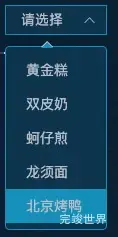
vue 数据大屏开发,要调整el-select下拉框样式 实现效果记录一下。
实现代码
/**
* @Author: 858834013@qq.com
* @Name: item1
* @Date: 2022-11-14
* @Desc:
*/
<template>
  <div class="item1s">
    <div class="item1sTitle">
      <div class="item1sTitlel">
        <img src="../../../../assets/home/titleIcon.png" alt="">
        <span>近3年各品类销售数量 </span>
      </div>
      <div class="item1sTitler">
        <el-select popper-class="popDown" class="w102" v-model="value" placeholder="请选择">
          <el-option
            v-for="item in options"
            :key="item.value"
            :label="item.label"
            :value="item.value">
          </el-option>
        </el-select>
      </div>
    </div>
  </div>
</template>

<script>

export default {
  name: "item1",
  components: {},
  props: {
    id: {
      type: String,
      default() {
        return '';
      }
    }
  },
  data() {
    return {
      options: [{
        value: '选项1',
        label: '黄金糕'
      }, {
        value: '选项2',
        label: '双皮奶'
      }, {
        value: '选项3',
        label: '蚵仔煎'
      }, {
        value: '选项4',
        label: '龙须面'
      }, {
        value: '选项5',
        label: '北京烤鸭'
      }],
      value: ''
    }
  },
  watch: {},
  mounted() {
  },
  methods: {}
}
</script>

<style lang="scss" scoped>
.item1s {
  width: 316px;
  height: 360px;
  margin-left: 24px;

  .item1sTitle {
    height: 70px;
    display: flex;
    justify-content: space-between;
    align-items: center;
    flex-wrap: nowrap;
    flex-direction: row;
    align-content: flex-start;
    background: url("../../../../assets/home/line1.png") center bottom no-repeat;
    background-size: 316px 2px;

    .item1sTitlel {
      display: flex;
      justify-content: flex-start;
      align-items: center;
      flex-wrap: nowrap;
      flex-direction: row;
      align-content: flex-start;

      span {
        font-size: 18px;
        font-family: MiSans;
        font-weight: 400;
        color: #E2EBF1;
        margin-left: 12px;
      }
    }

    .item1sTitler {
      .w102 {
        width: 102px;
        height: 29px;
      }

      ::v-deep {
        .el-input__inner {
          height: 30px;
          background: rgba(31, 158, 204, 0.2) !important;
          border: 1px solid rgba(32, 153, 197, 1) !important;
          border-radius: 0;
          font-size: 14px;
          font-family: MiSans;
          font-weight: 400;
          color: #E2EBF1;
        }

        .el-input__prefix, .el-input__suffix {
          height: 30px;
        }

        /* 下面设置右侧按钮居中 */
        .el-input__suffix {
          top: 0px;
          display: flex;
          justify-content: center;
          align-items: center;
          flex-wrap: nowrap;
          flex-direction: row;
          align-content: flex-start;
        }

        .el-input__icon {
          line-height: 32px;
        }
      }
    }
  }
}
</style>
<style lang="scss">
.popDown {
  border: 1px solid #2099c5;
  border-radius: 4px;
  background-color: #0c3b58;
  box-sizing: border-box;
  margin: 5px 0;

  .el-select-dropdown__item {
    color: #c0c4cb;
  }

  .el-select-dropdown__item.hover {
    background: #2099c5;
    color: #c0c4cb;
  }

  .popper__arrow::after {
    border-bottom-color: #2099c5 !important;
  }
}
</style>
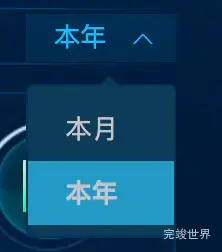
下拉菜单样式2
<div class="selectedTop">
  <el-select popper-class="popDown" class="w102" v-model="value" placeholder="请选择">
    <el-option
      v-for="item in options"
      :key="item.value"
      :label="item.label"
      :value="item.value">
    </el-option>
  </el-select>
</div>
data() {
    return {
      options: [{
        value: '本月',
        label: '本月'
      }, {
        value: '本年',
        label: '本年'
      }],
      value: '本月'
    }
  },
样式
:deep(.selectedTop) {
  display: flex;
  justify-content: flex-end;
  align-items: center;
  flex-wrap: nowrap;
  flex-direction: row;
  align-content: flex-start;
  position: absolute;
  top: -42px;
  right: 0;
  .el-input__inner {
    width: 80px;
    height: 26px;
    background: rgba(0,178,255,0.1) !important;
    opacity: 1;
    border: 0px solid rgba(32, 153, 197, 1) !important;
    border-radius: 0;
    font-size: 14px;
    font-weight: 400;
    color: rgba(0, 194, 255, 1);
  }

  .el-input__prefix, .el-input__suffix {
    height: 26px;
  }

  /* 下面设置右侧按钮居中 */
  .el-input__suffix {
    top: 0px;
    display: flex;
    justify-content: center;
    align-items: center;
    flex-wrap: nowrap;
    flex-direction: row;
    align-content: flex-start;
  }

  .el-input__icon {
    line-height: 26px;
    color: rgba(0, 194, 255, 1);
  }
}
下拉菜单样式 我们需要添加一个popper-class popper-class="popDown" 用来设置下拉菜单的样式
<style lang="scss">
.popDown {
  border: 1px solid #003158;
  border-radius: 4px;
  background-color: #0c3b58;
  box-sizing: border-box;
  margin: 0px 0;

  .el-select-dropdown__item {
    color: #c0c4cb;
  }

  .el-select-dropdown__item.hover {
    background: #2099c5;
    color: #c0c4cb;
  }

  .popper__arrow::after {
    border-bottom-color: #093a56 !important;
  }
}
.popDown .popper__arrow {
  border-bottom-color: #003158 !important;
}
</style>