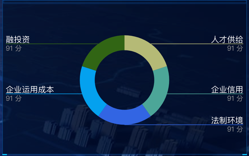
数据可视化大屏项目开发中,为了增加大屏样式的多元化,会设置各种各样的样式,今天要实现的效果样式是label分为两行,引导线从label两行文字中间穿过。
echarts版本
"echarts": "^5.2.0",
关键代码
label: {
  alignTo: 'edge',
  formatter: '{name|{b}}\n{time|{c} 分}',
  minMargin: 5,
  edgeDistance: 5,
  lineHeight: 15,
  rich: {
    name: {
      color: '#FFF', // 白色字体
      fontSize: 14, // 14号字体
    },
    time: {
      fontSize: 12, // 字号改为14
      color: '#999' // 灰色字体
    }
  }
},
labelLayout: function (params) {
  const isLeft = params.labelRect.x < myChart.getWidth() / 2;
  const points = params.labelLinePoints;
  // Update the end point.
  points[2][0] = isLeft
      ? params.labelRect.x
      : params.labelRect.x + params.labelRect.width;
  return {
    labelLinePoints: points
  };
},
参数介绍
alignTo
标签的对齐方式,仅当 position 值为 'outer' 时有效。
从 ECharts v4.6.0 版本起,我们提供了 'labelLine' 与 'edge' 两种新的布局方式。
'none'(默认值):label line 的长度为固定值,分别为 labelLine.length 及 labelLine.length2。
'labelLine':label line 的末端对齐,其中最短的长度由 labelLine.length2 决定。
'edge':文字对齐,文字的边距由 label.edgeDistance 决定。
labelLayout
从 v5.0.0 开始支持
标签的统一布局配置。
该配置项是在每个系列默认的标签布局基础上,统一调整标签的(x, y)位置,标签对齐等属性以实现想要的标签布局效果。
该配置项也可以是一个有如下参数的回调函数
// 标签对应数据的 dataIndex
dataIndex: number
// 标签对应的数据类型,只在关系图中会有 node 和 edge 数据类型的区分
dataType?: string
// 标签对应的系列的 index
seriesIndex: number
// 标签显示的文本
text: string
// 默认的标签的包围盒,由系列默认的标签布局决定
labelRect: {x: number, y: number, width: number, height: number}
// 默认的标签水平对齐
align: 'left' | 'center' | 'right'
// 默认的标签垂直对齐
verticalAlign: 'top' | 'middle' | 'bottom'
// 标签所对应的数据图形的包围盒,可用于定位标签位置
rect: {x: number, y: number, width: number, height: number}
// 默认引导线的位置,目前只有饼图(pie)和漏斗图(funnel)有默认标签位置
// 如果没有该值则为 null
labelLinePoints?: number[][]
完整实例代码
drawLine() {
  // 基于准备好的dom,初始化echarts实例
  window.addEventListener('resize', this.drawLine)
  const myChart = echarts.init(this.$refs.echarts)
  var option = {
    tooltip: {
      trigger: 'item',
    },
    color: ['#b5ba76', '#4ca698', '#3165e3', '#05a1ef', '#316513'],
    grid: {
      left: 10,
      top: 50,
      bottom: 10,
      right: 10,
      containLabel: true
    },
    polar: {},
    angleAxis: {
      interval: 1,
      type: 'category',
      data: [],
      z: 10,
      axisLine: {
        show: false,
        lineStyle: {
          color: '#10417d',
          width: 1,
          type: 'solid'
        }
      },
      axisLabel: {
        interval: 0,
        show: true,
        color: '#10417d',
        margin: 8,
        fontSize: 16
      }
    },
    radiusAxis: {
      min: 40,
      max: 120,
      interval: 20,
      axisLine: {
        show: false,
        lineStyle: {
          color: '#10417d',
          width: 1,
          type: 'solid'
        }
      },
      axisLabel: {
        formatter: '{value} %',
        show: false,
        padding: [0, 0, 20, 0],
        color: '#10417d',
        fontSize: 16
      },
      axisTick: { // y轴刻度线
        show: false
      },
      splitLine: {
        show: false,
        lineStyle: {
          color: '#10417d',
          width: 2,
          type: 'solid'
        }
      }
    },
    calculable: true,
    series: [
      {
        type: 'pie',
        center: ['50%', '50%'],
        radius: ['40%', '60%'],
        label: {
          alignTo: 'edge',
          formatter: '{name|{b}}\n{time|{c} 分}',
          minMargin: 5,
          edgeDistance: 5,
          lineHeight: 15,
          rich: {
            name: {
              color: '#FFF', // 白色字体
              fontSize: 14, // 14号字体
            },
            time: {
              fontSize: 12, // 字号改为14
              color: '#999' // 灰色字体
            }
          }
        },
        labelLayout: function (params) {
          const isLeft = params.labelRect.x < myChart.getWidth() / 2;
          const points = params.labelLinePoints;
          // Update the end point.
          points[2][0] = isLeft
              ? params.labelRect.x
              : params.labelRect.x + params.labelRect.width;
          return {
            labelLinePoints: points
          };
        },
        data: this.list
      }
    ]
  }
  myChart.clear()
  myChart.resize()
  myChart.setOption(option)
}


