echarts在绘制饼状图的时候,为了让饼状图能够多样性,会设计出多种不同样式的饼状图,今天的饼状图是有一种立体感的饼状图,效果如下:
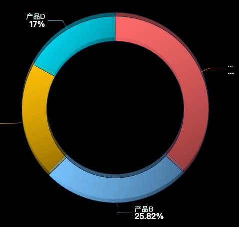
这里的饼状图分为两层,我们让两层饼状图稍微错位一点再给一个深浅不同的颜色就实现了我们想要的效果。
id
1
实例代码
const option = {
            tooltip: { trigger: 'item' },
            series: [
                {
                    type: 'pie',
                    center: ['50%', '50%'],
                    radius: ['55%', '75%'],
                    labelLine: { normal: { length: 20 } },
                    z: 1,
                    label: {
                        show: true,
                        formatter: (params) => `{a|${params.name}}\n{b|${params.percent}%}`,
                        rich: {
                            a: {
                                fontSize: 14,
                                fontFamily: 'sans-serif', // 替换 MiSans
                                fontWeight: 400,
                                color: '#D4F2F1'
                            },
                            b: {
                                fontSize: 16,
                                fontFamily: 'sans-serif',
                                fontWeight: 600,
                                color: '#FFFFFF'
                            }
                        }
                    },
                    itemStyle: {
                        normal: {
                            borderColor: '#142b47',
                            borderWidth: 1
                        }
                    },
                    data: data
                },
                {
                    z: 0,
                    type: 'pie',
                    center: ['50%', '48.5%'],
                    radius: ['55%', '75%'],
                    labelLine: { normal: { length: 20 } },
                    label: {
                        show: false,
                        position: 'inside',
                        formatter: '{d}%',
                        color: '#fff',
                        fontSize: 16
                    },
                    itemStyle: {
                        normal: {
                            borderColor: '#142b47',
                            borderWidth: 1
                        }
                    },
                    data: data2
                }
            ]
        };
完整实例代码
相关文件下载地址


