数据可视化大屏 开发中,需要显示各种各样效果的柱状图,今天整理的是 颜色渐变异形柱状图
echarts 柱状图颜色渐变
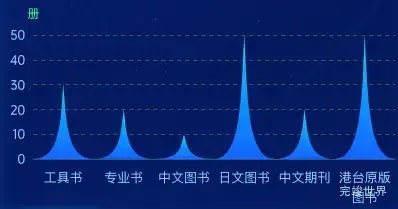
显示单位,
显示虚线网格
限制字符长度换行
使用pictorialBar实现异形柱状图
echarts版本
"echarts": "^5.5.0",
使用组件
<template>
  <div class="itemBodys">
    <echarts1 :list="list"></echarts1>
  </div>
</template>

<script>
import echarts1 from './components/echarts.vue'
export default {
  name: "title",
  data() {
    return {
      list: [
        {
          title: '工具书',
          value: 30,
          id: 'awardGradeSpecial'
        },
        {
          title: '专业书',
          value: 20,
          id: 'awardGradeFirst'
        }, {
          title: '中文图书',
          value: 10,
          id: 'awardGradeSecond'
        }, {
          title: '日文图书',
          value: 50,
          id: 'awardGradeThird'
        }, {
          title: '中文期刊',
          value: 20,
          id: 'awardGradeNone'
        }, {
          title: '港台原版图书',
          value: 50,
          id: 'awardGradeNone'
        },
      ],
    }
  },
  components: {echarts1},
  watch: {},
  mounted() {
    var that = this;
  },
  methods: {
  },
}
</script>

<style lang="scss" scoped>
.itemBodys {
  position: relative;
  width: calc(100% - 0px);
  height: calc(100% - 0px);
  margin: 0 auto;
  display: flex;
  justify-content: center;
  align-items: center;
  flex-wrap: nowrap;
  flex-direction: row;
  align-content: flex-start;
}
</style>
组件代码
<template>
  <div className="echarts1" ref="echarts">

  </div>
</template>

<script>
import * as echarts from "echarts";

export default {
  name: 'echarts1',
  components: {},
  watch: {
    xData() {
      this.drawEcharts()
    },
    yData() {
      this.drawEcharts()
    },
  },
  props: {
    list: {
      type: Array,
      default() {
        return [];
      }
    }
  },
  mounted() {
    this.drawEcharts()
  },
  computed: {
    xData: function () {
      var list = []
      this.list.forEach((type) => {
        list.push(type.title)
      });
      return list
    },
    yData: function () {
      var list = []
      this.list.forEach((type) => {
        var data = {
          value: type.value
        }
        list.push(data)
      });
      return list
    },
  },
  methods: {
    drawEcharts() {
      var that = this
      window.addEventListener('resize', this.drawEcharts)
      let myChart = echarts.init(this.$refs.echarts)
      var spliceStr = function (value, len) {
        if (value.length <= len) {
          return value
        }

        var newValue = "";
        var k = 0;
        for (var i = Math.ceil(value.length / len); i > 0; i--) {

          newValue += value.substr(k, len) + (i == 1 ? '' : '\n');
          k += len;

        }
        return newValue;
      }
      var option = {
        textStyle: {
          color: '#c0c3cd',
          fontSize: 14,
        },
        color: ['#00D7E9', 'rgba(0, 215, 233, 0.9)'],
        grid: {
          containLabel: true,
          left: 20,
          right: 20,
          bottom: 0,
          top: 40,
        },
        xAxis: {
          nameTextStyle: {
            color: '#c0c3cd',
            padding: [0, 0, -10, 0],
            fontSize: 13,
          },
          axisLabel: {
            color: 'rgba(149, 201, 255, 1)',
            fontSize: 13,
            interval: 0,
            lineHeight: 20,
            formatter: function (value) {
              return spliceStr(value, 4)
            },
          },
          axisTick: {
            show: false,
            lineStyle: {
              color: '#384267',
              width: 1,
            },
          },
          splitLine: {
            show: false,
          },
          axisLine: {
            lineStyle: {
              color: '#335971',
            },
            show: true,
          },
          data: this.xData,
          type: 'category',
        },
        yAxis: {
          name: '册',
          nameTextStyle: {
            color: 'rgba(11, 255, 168, 1)',
            padding: [0, 0, 0, 0],
            fontSize: 12,
          },
          axisLabel: {
            color: 'rgba(149, 201, 255, 1)',
            fontSize: 12,
            interval: 0,
            fontFamily: 'OPPOSans'
          },
          axisTick: {
            lineStyle: {
              color: '#668092',
              width: 0,
            },
            show: true,
          },
          splitLine: {
            show: true,
            lineStyle: {
              color: '#335971',
              "type": "dashed"
            },
          },
          axisLine: {
            lineStyle: {
              color: 'rgba(8, 46, 124, 1.00)',
              width: 1,
              type: "dashed"
            },
            show: false,
          }
        },
        series: [
          {
            data: this.yData,
            barWidth: '100%',
            type: "pictorialBar",
            barCategoryGap: "100%",
            symbol: "path://M0,10 L10,10 C5.5,10 5.5,5 5,0 C4.5,5 4.5,10 0,10 z",
            itemStyle: {
              color: {
                x: 0,
                y: 1,
                x2: 0,
                y2: 0,
                type: 'linear',
                colorStops: [
                  {
                    offset: 0,
                    color: 'rgba(18, 99, 255, 1)',
                  },
                  {
                    offset: 1,
                    color: 'rgba(4, 206, 247, 1)',
                  },
                ],
              },
            },
            label: {
              show: false,
              position: 'top',
              distance: 10,
              color: '#fff',
              fontFamily: 'DIN-bold'
            },
          }
        ],
        tooltip: {
          show: true,
          trigger: 'axis',
          formatter: '{b}:{c0}',
        },
      };
      myChart.clear()
      myChart.resize()
      myChart.setOption(option)
    },
  }
}
</script>

<style lang="scss" scoped>
.echarts1 {
  position: relative;
  width: 100%;
  height: calc(100% - 20px);
}
</style>