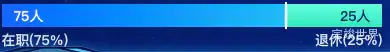
vue 数据可视化大屏中,有时会需要显示一个占比进度条,两种类型根据数量显示占比,但是直接把样式写出来,又感觉单调了一点,于是想着能不能增加一个动画效果呢?让这个占比有一个推进的效果。

因为在之前已经写过一个类似的进度条占比效果,所以我们直接拿过来在之前的基础上微调一下就可以使用了。
首先把样式写出来,我们先给一个最小宽度,避免因为数值小导致内容无法完整显示,然后我们使用gsap来增加一个动画效果。让div从最小宽度达到原本应该占有的宽度,这样一个动画效果就出现了。
<template>
  <div class="progressBar">
    <div class="progressBars">
      <div class="progressBarsLine" :class="{progressBarsLine2:index==0}"
           :style="{background:'linear-gradient(270deg, '+item.bg1+' 0%, '+item.bg2+' 100%)'}"
           v-for="(item,index) in list2"
           :key="index">
        <span :class="'label'+index">{{ item.label }}({{ item.percentage }}%)</span>
        <span :class="'percentage'+index">{{ item.value }}人</span>
        <div v-if="index==0" class="lines"></div>
      </div>
    </div>
  </div>
</template>

<script>
import gsap from "gsap";

export default {
  name: "progressBar",
  components: {},
  props: {
    id: {
      type: String,
      default() {
        return '';
      }
    }
  },
  data() {
    return {
      list: [
        {
          label: '在职',
          value: 75,
          bg1: 'rgba(4, 189, 247, 1)',
          bg2: 'rgba(18, 99, 255, 1)',
        },
        {
          label: '退休',
          value: 25,
          bg1: 'rgba(51, 231, 191, 0)',
          bg2: 'rgba(105, 254, 221, 0)'
        },
      ],
    }
  },
  watch: {},
  computed: {
    list2: function () {
      let total = 0
      var list2 = this.list;
      var list = []
      this.list.forEach((type) => {
        total = total + type.value
      });
      list2.forEach((type) => {
        var data = {
          value: type.value,
          percentage: Number((type.value / total) * 100).toFixed(0),
          label: type.label,
          bg1: type.bg1,
          bg2: type.bg2,
        }
        list.push(data)
      });
      return list
    }
  },
  mounted() {
    var that = this;
    setTimeout(() => {
      gsap.to('.progressBarsLine2', {
        duration: 1.5, width: that.list2[0].percentage + '%', onComplete: () => {
          console.log('动画完成')
        }
      })
    }, 2500)
  },
  methods: {}
}
</script>

<style lang="scss" scoped>
.progressBars {
  width: calc(100% - 0px);
  margin: auto;
  display: flex;
  justify-content: space-between;
  align-items: center;
  flex-wrap: nowrap;
  flex-direction: row;
  background: linear-gradient(360deg, #33E7BF 0%, #69FEDD 100%);
  position: relative;
}

.progressBar {
  width: calc(100% - 0px);
  margin: 0 auto;
  display: flex;
  justify-content: center;
  align-items: center;
  flex-wrap: nowrap;
  flex-direction: row;

  .progressBarsLine {
    color: #fff;
    font-size: 14px;
    display: flex;
    justify-content: center;
    align-items: center;
    flex-wrap: nowrap;
    flex-direction: row;
    height: 24px;
    position: relative;
    min-width: 20%;
  }

  .label0 {
    position: absolute;
    font-size: 14px;
    left: 0;
    top: 27px;
    font-family: PingFang SC-Bold, PingFang SC;
    font-weight: bold;
    color: rgba(215, 231, 255, 1);
  }

  .label1 {
    font-size: 14px;
    top: 27px;
    font-family: PingFang SC-Bold, PingFang SC;
    font-weight: bold;
    color: rgba(215, 231, 255, 1);
    right: 0;
    position: absolute;
  }


  .percentage0 {
    left: 12px;
    font-size: 14px;
    font-family: PingFang SC-Bold, PingFang SC;
    font-weight: bold;
    color: #FFFFFF;
    position: absolute;
  }

  .percentage1 {
    right: 12px;
    font-size: 14px;
    font-family: PingFang SC-Bold, PingFang SC;
    font-weight: bold;
    color: rgba(2, 29, 107, 1);
    position: absolute;
  }

  p:first-child {
    border-radius: 5px 0 0 5px;
  }

  p:last-child {
    border-radius: 0 5px 5px 0;
  }
}

.lines {
  width: 2px;
  height: 28px;
  background: #FFFFFF;
  opacity: 1;
  position: absolute;
  right: 0;
}
</style>