通过使用element ui 实现的自定义进度条效果实例
更多进度条效果实例
item
<template>
  <div class="paimingitems">
    <div class="paimingitemstop">
      <span class="num">{{ name }}</span>
      <p>{{ percentage }}%</p>
    </div>
    <div class="paimingitemsbottom">
      <div class="progress">
        <el-progress :show-text="false" stroke-width="20" :percentage="percentage"></el-progress>
      </div>
    </div>
  </div>
</template>

<script>

export default {
  name: 'item',
  components: {},
  props: {
    index: {
      type: String,
      default () {
        return ''
      }
    },
    name: {
      type: String,
      default () {
        return ''
      }
    },
    num: {
      type: String,
      default () {
        return ''
      }
    },
    percentage: {
      type: Number,
      default () {
        return 0
      }
    },
  },
  data () {
    return {
      status: ''
    }
  },
  watch: {},
  mounted () {
  },
  methods: {
    format (list) {
      return () => {
        return this.num
      }
    }
  }
}
</script>

<style lang="scss" scoped>
.paimingitems {
  background-size: 100% 100%;
  width: 100%;
  height: 100%;
  position: relative;
  display: flex;
  justify-content: center;
  align-items: flex-start;
  flex-wrap: nowrap;
  flex-direction: column;

  .paimingitemstop {
    display: flex;
    justify-content: space-between;
    align-items: center;
    flex-wrap: nowrap;
    flex-direction: row;
    width: 100%;

    .num {
      display: flex;
      justify-content: center;
      align-items: center;
      flex-wrap: nowrap;
      flex-direction: row;
      font-size: 14px;
      font-family: MicrosoftYaHei;
      font-weight: 400;
      color: #FFFFFF;
    }

    p {
      font-size: 14px;
      font-family: MicrosoftYaHei;
      font-weight: 400;
      color: #FFFFFF;
    }
  }

  .paimingitemsbottom {
    display: flex;
    justify-content: flex-start;
    align-items: center;
    flex-wrap: nowrap;
    flex-direction: row;
    width: calc(100% - 0px);
    margin-left: 0px;

    .progress {
      width: 100%;
    }

    ::v-deep {
      .el-progress-bar__outer {
        background: #001B98 !important;
        overflow: inherit;
        border-radius: 0;
      }

      .el-progress-bar__inner {
        border-radius: 0;
        background: linear-gradient(90deg, #001FE9 0%, #0FD5FF 100%);
      }
    }
  }
}
</style>
vue
<div class="paiming1 scroll">
<div class="paiming1item" v-for="(item,index) in list" :key="index">
<item :index="index+1" :name="item.type" :num="item.num"
:percentage="(item.num/max)*100"></item>
</div>
</div>
<script>
import item from './nianling/item'
export default {
name: 'paiming',
components: {
item
},
props: {
id: {
type: String,
default () {
return ''
}
}
},
data () {
return {
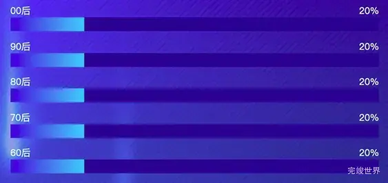
list: [
{
type: '00后',
num: 500
}, {
type: '90后',
num: 500
}, {
type: '80后',
num: 500
}, {
type: '70后',
num: 500
}, {
type: '60后',
num: 500
},
],
}
},
computed: {
max: function () {
let max = 0
this.list.forEach((type) => {
max = max + Number(type.num)
})
return max
}
},
}
</script>
<style lang="scss" scoped>
.paiming1 {
width: calc(100% - 20px);
margin-left: 20px;
height: calc(100% - 30px);
margin-top: 0px;
display: flex;
justify-content: flex-start;
align-items: flex-start;
flex-wrap: wrap;
flex-direction: row;
position: relative;
overflow-y: auto;
.paiming1item {
width: calc(100% - 20px);
margin-right: 20px;
height: 20%;
position: relative;
}
}
</style>