ID
35
配置代码
let option = {
backgroundColor: '#fff',
tooltip: {
trigger: 'axis',
extraCssText: 'padding:5px;display:flex;font-size:12px;line-height:24px;color:black;background:#fff;box-shadow:0 0 3px rgba(0, 0, 0, 0.2)',
formatter: function(params) {
let date = '', state = '', value = 0;
for (let i = 0; i < params.length; i++) {
let obj = params[i];
if (obj.value !== '-') {
value = obj.value;
date = obj.axisValue;
state = obj.seriesName;
break;
}
}
let type = predictSet.has(date) ? '预测' : '实际';
let lineType = type === '实际' ? 'solid' : 'dashed';
return `<div><span style="display:inline-block;margin-bottom:5px;width:20px;height:10px;border-bottom:1px ${lineType} ${colorMap[state]}"></span><span style="margin-left:10px">${type}:</span><span style="margin-left:10px;font-weight:500;font-size:18px">${value.toFixed(0)}</span><span style="padding:5px;margin-left:10px;background:${hex2rgb(colorMap[state])},0.3);border-radius:4px;color:${colorMap[state]}">${state}</span></div>`;
}
},
legend: {
show: true,
top: 10,
itemWidth: 15,
itemHeight: 15,
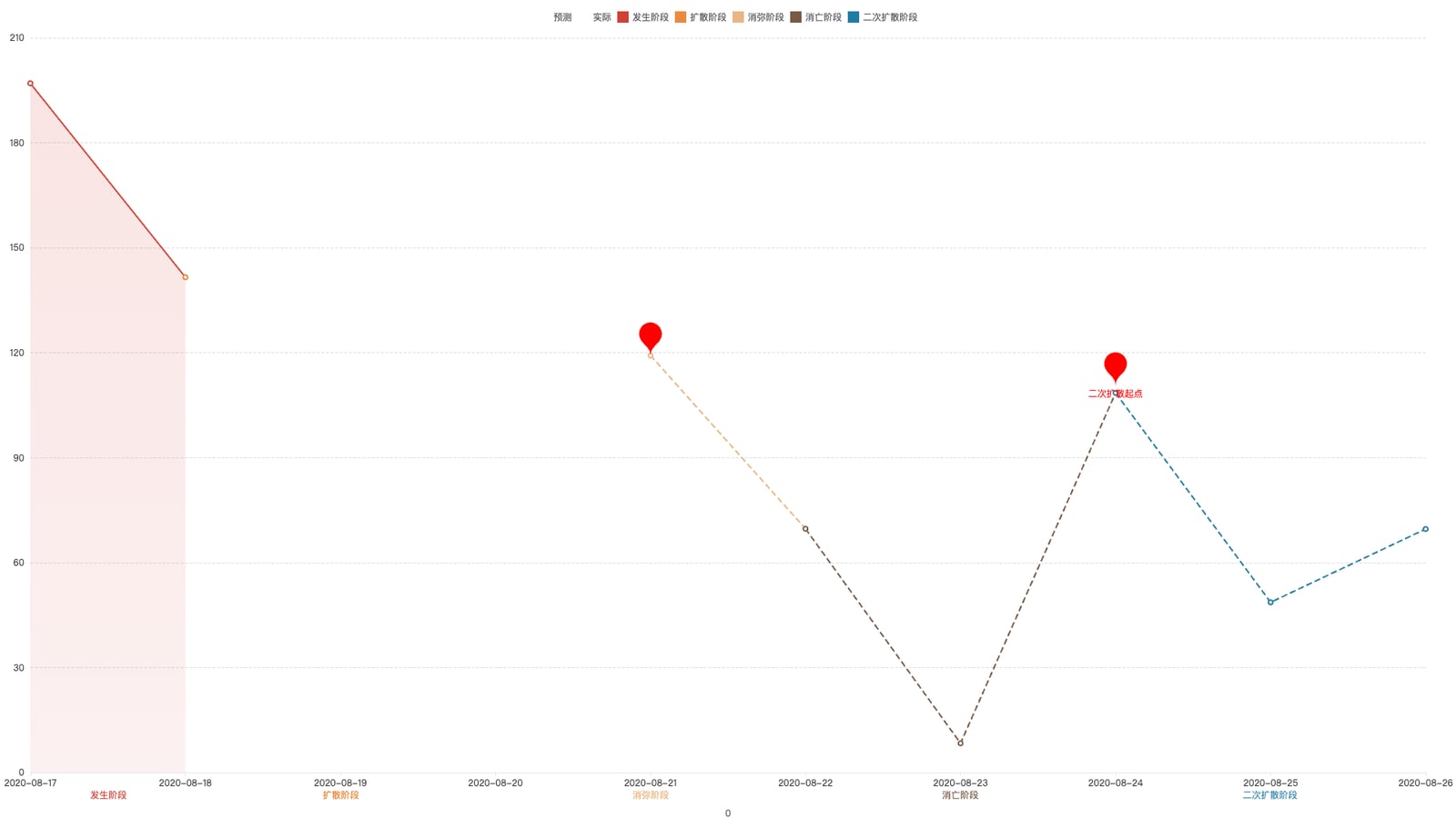
data: [
{name: '预测', icon: 'line'},
{name: '实际', icon: 'line'},
{name: '发生阶段', icon: 'rect'},
{name: '扩散阶段', icon: 'rect'},
{name: '消弥阶段', icon: 'rect'},
{name: '消亡阶段', icon: 'rect'},
{name: '二次扩散阶段', icon: 'rect'}
]
},
grid: [
{top: 50, bottom: 60, left: 40, right: 40},
{left: 40, right: 40, height: 40, bottom: 20}
],
xAxis: [
{
type: 'category',
data: data.xData,
boundaryGap: false,
gridIndex: 0,
axisLabel: {color: '#333'},
axisLine: {lineStyle: {color: '#e7e7e7'}},
axisTick: {lineStyle: {color: '#e7e7e7'}},
zlevel: 2
},
{
type: 'category',
gridIndex: 1,
axisLine: {show: false},
zlevel: 1
}
],
yAxis: [
{
type: 'value',
gridIndex: 0,
axisLabel: {color: '#333'},
splitLine: {lineStyle: {type: 'dashed'}},
axisLine: {lineStyle: {color: '#ccc'}},
axisTick: {lineStyle: {color: '#ccc'}}
},
{
type: 'value',
gridIndex: 1,
axisLabel: {show: false},
axisLine: {show: false},
splitLine: {show: false},
axisTick: {show: false}
}
],
series: series
};
完整示例代码
相关文件下载地址


