echarts柱状图开发中,我们需要渲染各种各样的柱状图,今天整理的柱状图为自定义图片横向柱状图。
这里我们将柱状图分为两部分 一部分为主体,主体部分拉伸不受太大的视觉影响,一部分为最右侧的异形部分。
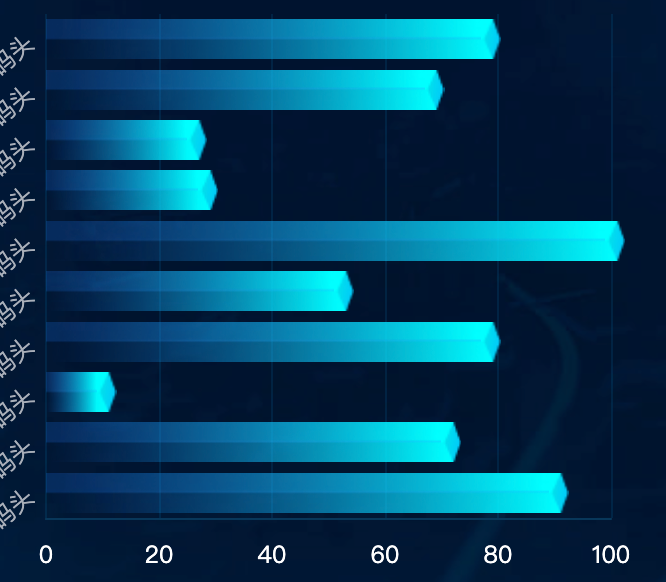
实例代码
drawLine() {
      var that = this
      window.addEventListener('resize', this.drawLine)
      let myChart = echarts.init(this.$refs.echarts)
      var barWidth = 20
      var option = {
        textStyle: {
          color: '#c0c3cd',
          fontSize: 14,
        },
        legend: {
          show: false,
          top: 10,
          itemWidth: 8,
          itemHeight: 8,
          icon: 'circle',
          left: 'center',
          padding: 0,
          textStyle: {
            color: '#c0c3cd',
            fontSize: 14,
            padding: [2, 0, 0, 0],
          },
        },
        color: ['#00D7E9', 'rgba(0, 215, 233, 0.9)'],
        grid: {
          containLabel: true,
          left: 10,
          right: 10,
          bottom: 10,
          top: 40,
        },
        xAxis: {
          nameTextStyle: {
            color: 'rgba(149, 201, 255, 1)',
            padding: [0, 0, -10, 0],
            fontSize: 12,
          },
          axisLabel: {
            color: 'rgba(255, 255, 255, 1)',
            fontSize: 12,
            interval: 0,
            lineHeight: 20,

          },
          axisTick: {
            show: false,
            lineStyle: {
              color: '#384267',
              width: 1,
            },
          },
          splitLine: {
            show: true,
            lineStyle: {
              color: 'rgba(0, 178, 255, 0.1)'
            },
          },
          axisLine: {
            lineStyle: {
              color: '#093759',
            },
            show: true,
          },
        },
        yAxis: {
          type: 'category',
          minInterval: 10,
          axisLabel: {
            color: '#a9afb9',
            fontSize: 14,
            interval: 0,
            fontFamily: 'DIN_Bold',
            rotate: 45  // 设置文字倾斜45度
          },
          data: this.list.map(obj => obj.name),
          axisTick: {
            lineStyle: {
              color: '#668092',
              width: 0,
            },
            show: true,
          },
          splitLine: {
            show: false,
          },
          axisLine: {
            lineStyle: {
              color: 'rgba(8, 46, 124, 1.00)',
              width: 1,
              type: "dashed"
            },
            show: false,
          }
        },
        series: [
          {
            name: '数量',
            type: 'pictorialBar',
            symbol: 'image://' + bg,
            symbolSize: ['100%', barWidth],
            data: this.list.map(obj => obj.value), // 减去底部的高度
            barWidth: barWidth
          },
          {
            name: '数量2', // 顶部
            type: 'pictorialBar',
            symbolPosition: 'end',
            symbol: 'image://' + bgTop,
            symbolSize: [10, barWidth],
            symbolOffset: [10, 0],
            data: this.list.map(obj => obj.value), // 设置顶部位置
            barWidth: barWidth,
          },
        ],
        tooltip: {
          show: true,
          trigger: 'axis',
          formatter: '{b}:{c0}',
        },
      };
      myChart.clear()
      myChart.resize()
      myChart.setOption(option)
    },


