vue外包项目 经常会遇到需要排行榜的效果,这次ui设计 出的数据可视化大屏 里排行榜效果如下:
效果描述
排行榜柱状图的颜色需要渐变
排行榜柱状图的尾端有一段与其他部位不同的白色色块
排行榜柱状图的数字颜色跟随柱状图的颜色变化
排行榜柱状图有一个边框
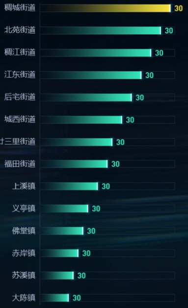
ui设计图的效果
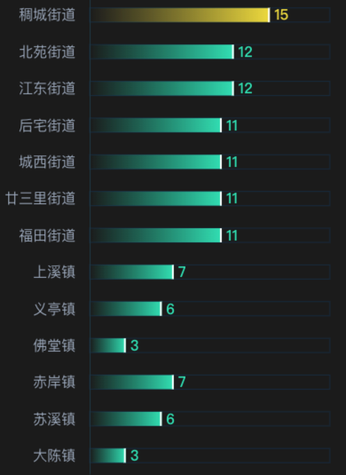
echarts实现的效果
实现代码
<template>
  <div class="item2" ref="myChart1">

  </div>
</template>

<script>

import echarts from 'echarts'

export default {
  name: "echarts1",
  data() {
    return {
      yData: [15, 12, 12, 11, 11, 11, 11, 7, 6, 3, 7, 6, 3],
      data: [
        '稠城街道',
        '北苑街道',
        '江东街道',
        '后宅街道',
        '城西街道',
        '廿三里街道',
        '福田街道',
        '上溪镇',
        '义亭镇',
        '佛堂镇',
        '赤岸镇',
        '苏溪镇',
        '大陈镇',
      ]
    }
  },
  watch: {},
  mounted() {
    this.lines()
  },
  methods: {
    lines() {
      var that = this;
      window.addEventListener('resize', this.lines)
      let myChart = echarts.init(this.$refs.myChart1);
      let colorList = [
        "rgba(241, 222, 77, 1.00)",
        "rgba(52, 226, 192, 1.00)",
        "rgba(52, 226, 192, 1.00)",
        "rgba(52, 226, 192, 1.00)",
        "rgba(52, 226, 192, 1.00)",
        "rgba(52, 226, 192, 1.00)",
        "rgba(52, 226, 192, 1.00)",
        "rgba(52, 226, 192, 1.00)",
        "rgba(52, 226, 192, 1.00)",
        "rgba(52, 226, 192, 1.00)",
        "rgba(52, 226, 192, 1.00)",
        "rgba(52, 226, 192, 1.00)",
        "rgba(52, 226, 192, 1.00)",
      ];
      let colorList2 = [
        "rgba(241, 222, 77, 0)",
        "rgba(52, 226, 192, 0)",
        "rgba(52, 226, 192, 0)",
        "rgba(52, 226, 192, 0)",
        "rgba(52, 226, 192, 0)",
        "rgba(52, 226, 192, 0)",
        "rgba(52, 226, 192, 0)",
        "rgba(52, 226, 192, 0)",
        "rgba(52, 226, 192, 0)",
        "rgba(52, 226, 192, 0)",
        "rgba(52, 226, 192, 0)",
        "rgba(52, 226, 192, 0)",
        "rgba(52, 226, 192, 0)",
      ];
      var option = {
        tooltip: {show: true},
        grid: {left: 10, top: 30, bottom: 30, right: 10, containLabel: true},
        xAxis: {
          type: "value",
          show: false,
          boundaryGap: false,
          max: 20, // Math.ceil(max / 4) * 5 || 10
          axisLine: {show: true, lineStyle: {color: "#294955"}},
          axisTick: {show: false},
          axisLabel: {color: "#999"},
          splitLine: {
            show: false,
            lineStyle: {color: ["#CEEDFF"], type: [5, 8], dashOffset: 3},
          },
        },
        yAxis: {
          type: "category",
          data: this.data,
          axisLine: {show: true, lineStyle: {color: "#294955"}},
          axisTick: {length: 0},
          axisLabel: {fontSize: 16, color: "rgba(169, 181, 197, 1.00)", margin: 16, padding: 0},
          inverse: true,
        },
        series: [
          {
            name: "数量",
            type: "bar",
            showBackground: true,
            backgroundStyle: {
              color: "rgba(82, 168, 255, 0)",
              borderRadius: [0, 0, 0, 0],
              borderColor: 'rgba(28, 56, 78, 1.00)',
              borderWidth: 1
            },
            itemStyle: {
              color: "#52A8FF",
              normal: {
                borderRadius: [0, 0, 0, 0],
                color: function (params) {
                  // 定义一个颜色集合
                  var colors = new echarts.graphic.LinearGradient(0, 0, 1, 0, [{
                    offset: 0,
                    color: colorList2[params.dataIndex]
                  }, {
                    offset: 1,
                    color: colorList[params.dataIndex]
                  }], false)
                  // 对每个bar显示一种颜色
                  return colors;
                },
              },
            },
            barMaxWidth: 16,
            label: {
              show: true,
              position: "right",
              offset: [0, 0],
              color: function (params) {
                return colorList[params.dataIndex];
              },
              fontSize: 16,
              fontFamily: 'DIN',
              fontWeight: 'bold',
            },
            "z": 0,
            data: this.yData,
          },
          {
            "data": this.yData,
            "type": "pictorialBar",
            "barMaxWidth": "10",
            "symbolPosition": "end",
            "symbol": "Rectangle",
            "symbolOffset": [0, "0%"],
            "symbolSize": [2, 16],
            "z": 2,
            itemStyle: {
              normal: {
                borderWidth: 0,
                color: 'rgba(254, 254, 254, 1.00)',
              }
            },
          },
        ],
      }
      myChart.clear();
      myChart.resize();
      myChart.setOption(option);
    },
  },
}
</script>

<style lang="scss" scoped>
.item2 {
  position: relative;
  width: 100%;
  height: calc(100% - 52px);
}
</style>


