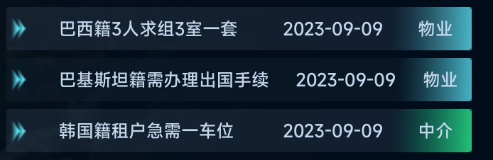
数据可视化大屏项目开发中,当父元素设置了display: flex;后,子元素指定宽度无效,文字仍然会超出边界外。
解决办法
给元素添加min-width: 0;属性,这样元素的宽度就不会超过你设置的值了。
修改前
.tableBody2 {
      height: 32px;
      display: flex;
      justify-content: center;
      align-items: center;
      flex-wrap: nowrap;
      flex-direction: row;
      position: relative;
      width: calc(100% - 20px);
      padding-left: 20px;
      background: url("./assets/itembg1.png") no-repeat;
      background-size: 100% 100%;
      margin-bottom: 6px;

      .tableBody2Item {
        font-size: 14px;
        font-family: MicrosoftYaHei;
        font-weight: 400;
        color: #FFFFFF;
        display: flex;
        position: relative;
        height: 100%;
        justify-content: center;
        align-items: center;
        flex-wrap: nowrap;
        flex-direction: row;
        padding-left: 20px;

        .num {
          width: calc(100% - 0px);
          overflow: hidden;
          white-space: nowrap;
          text-overflow: ellipsis;
          text-align: left;
          font-size: 13px;
          font-family: MiSans;
          font-weight: 400;
          color: #C2D6EB;
        }
      }
    }
修改后
.tableBody2 {
      height: 32px;
      display: flex;
      justify-content: center;
      align-items: center;
      flex-wrap: nowrap;
      flex-direction: row;
      position: relative;
      width: calc(100% - 20px);
      padding-left: 20px;
      background: url("./assets/itembg1.png") no-repeat;
      background-size: 100% 100%;
      margin-bottom: 6px;

      .tableBody2Item {
        font-size: 14px;
        font-family: MicrosoftYaHei;
        font-weight: 400;
        color: #FFFFFF;
        display: flex;
        position: relative;
        height: 100%;
        justify-content: center;
        align-items: center;
        flex-wrap: nowrap;
        flex-direction: row;
        padding-left: 20px;
        min-width: 0;
        .num {
          width: calc(100% - 0px);
          overflow: hidden;
          white-space: nowrap;
          text-overflow: ellipsis;
          text-align: left;
          font-size: 13px;
          font-family: MiSans;
          font-weight: 400;
          color: #C2D6EB;
        }
      }
    }
原因
在Flex布局中,子元素的默认行为是尽可能地占用空间,即使这意味着它们的内容会超出其边界。这是因为在Flex布局中,子元素的min-width默认值是auto,而不是0。这意味着子元素的最小宽度默认是其内容的宽度,而不是0。因此,如果子元素的内容宽度大于其父元素的宽度,那么子元素就会超出其父元素的边界。
当你设置min-width: 0;时,你实际上是在告诉浏览器,子元素的最小宽度可以是0,而不是其内容的宽度。这样,子元素就可以在其内容宽度大于其父元素的宽度时,缩小到其父元素的宽度,而不会超出其父元素的边界。这就是为什么设置min-width: 0;可以解决子元素超出其父元素边界的问题的原理。